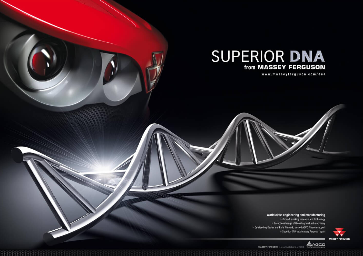
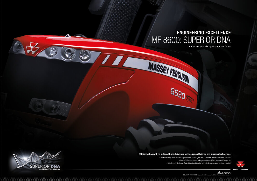
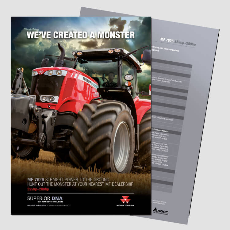
Massey Ferguson is one of the world’s largest tractor brands with superior engineering and world-class manufacturing at the heart of everything they do. The ‘Superior DNA’ brand platform message began a Europe-wide change in how the market now responds to and recognises the Massey Ferguson brand across Europe.

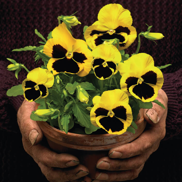
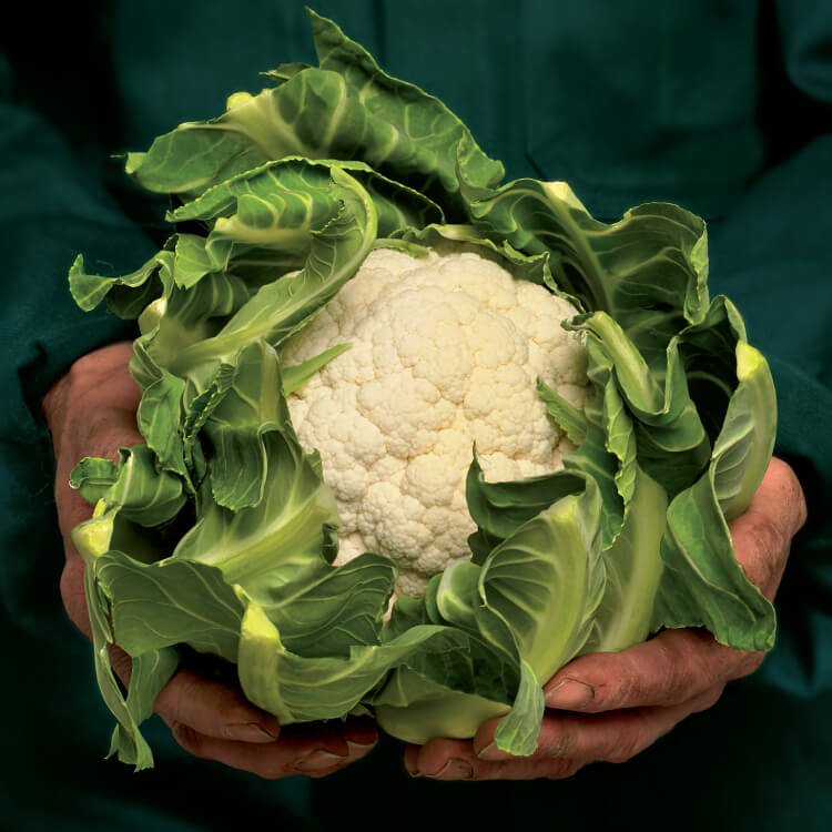
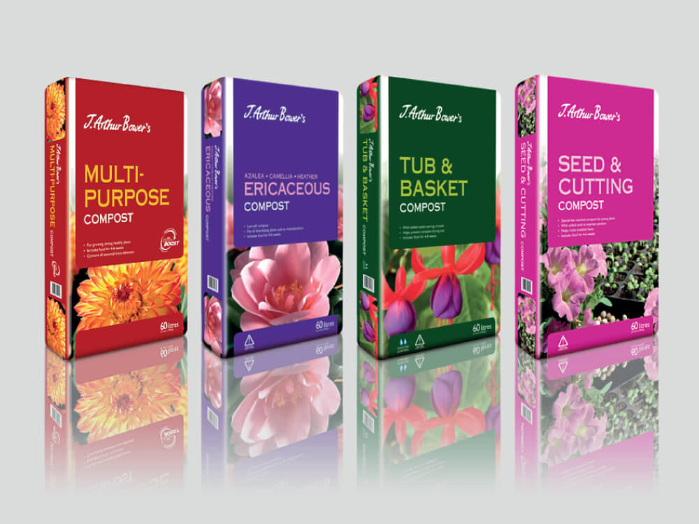
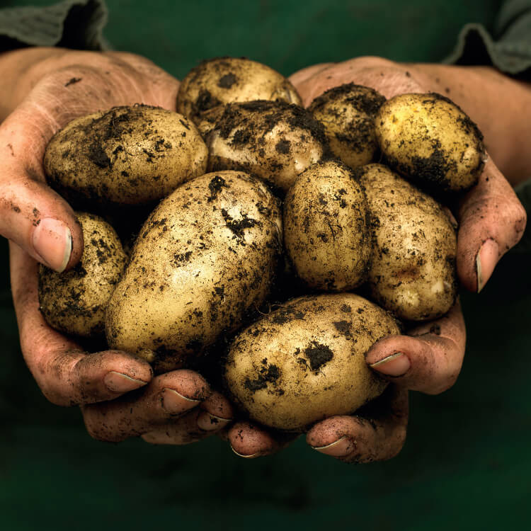
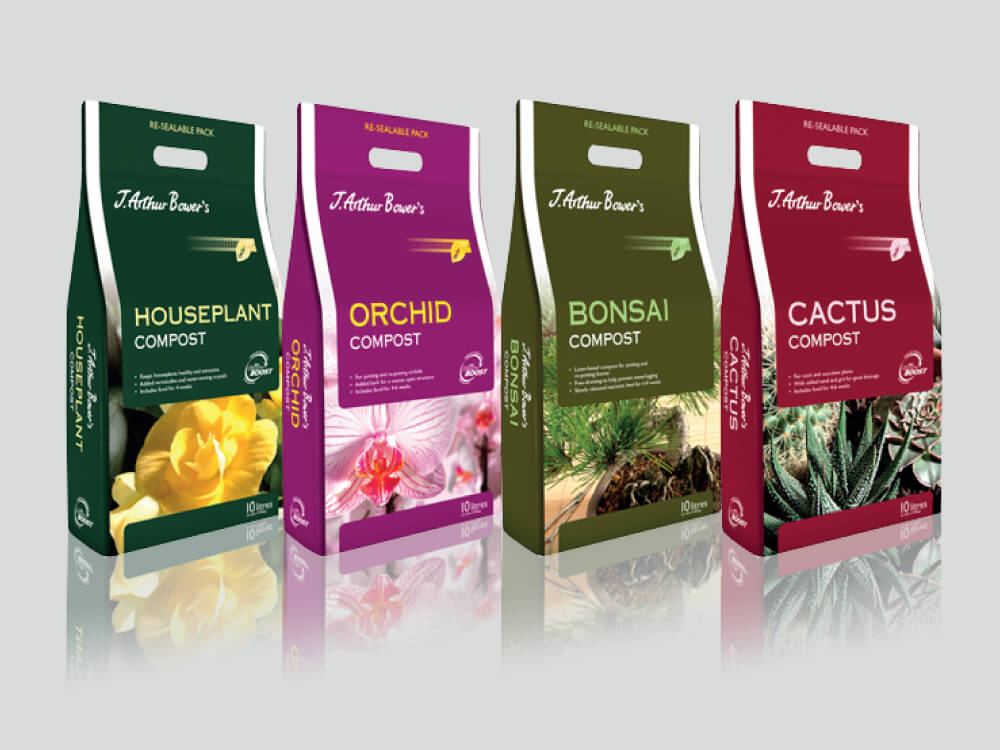
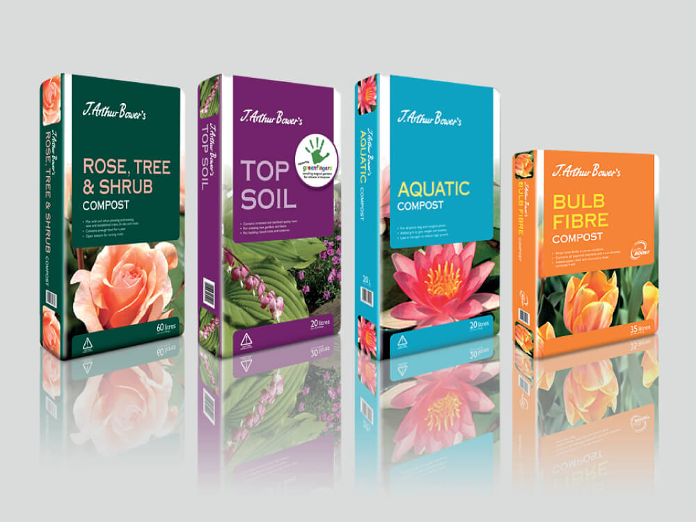
Engaging, impactful imagery is essential when creating any horticultural packaging. Crimson Cat’s stunning photography and in-house re-touching culminated in imagery that really ‘sells the gardening dream’ on the J. Arthur Bower’s range available in garden centres throughout the UK. Customers are responding well to the brand’s position, now perfectly conveyed on pack, of trust and genuine knowledge.








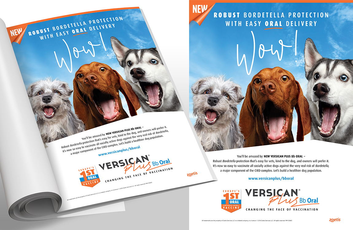
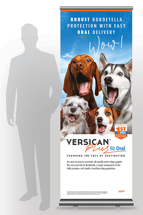
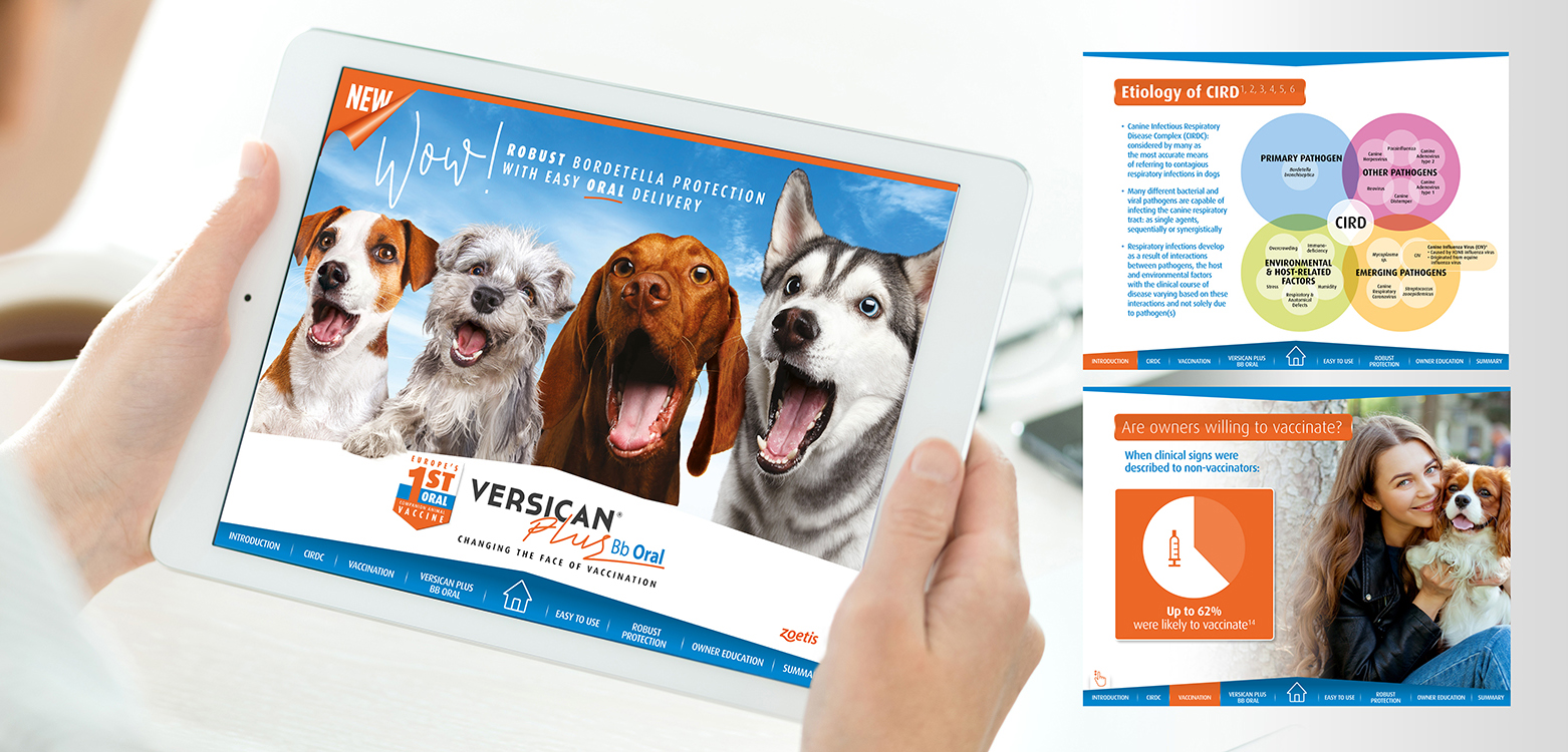
Zoetis, the world’s leading animal health company, chose Crimson Cat to create a jaw dropping campaign for their new vaccine. The award-winning ‘Wow!’ campaign quite literally announces the changing face of vaccination with the introduction of Versican Plus Bb Oral – robust Bordetella protection with easy oral delivery. So easy for vets, kind to dogs and offering a great experience for owners. The engaging image of 4 dogs opened mouthed in delight, cleverly highlights the oral administration.

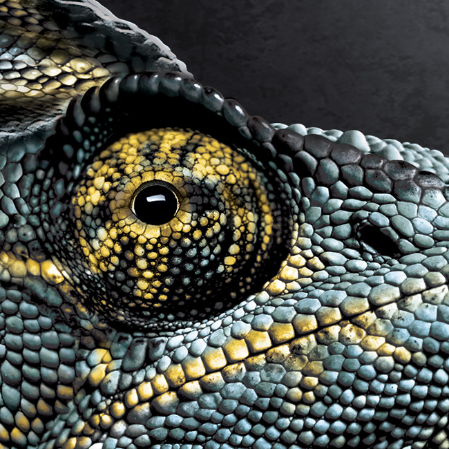
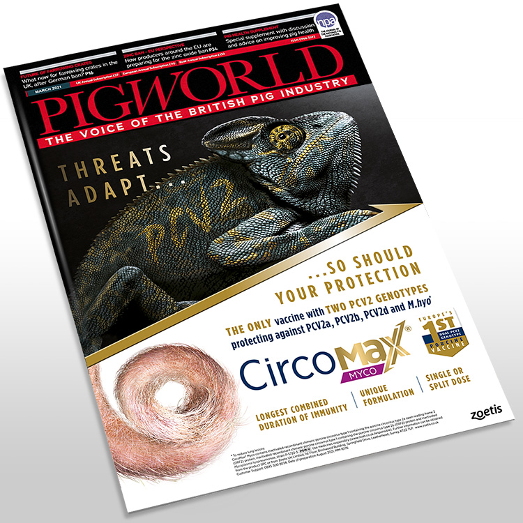
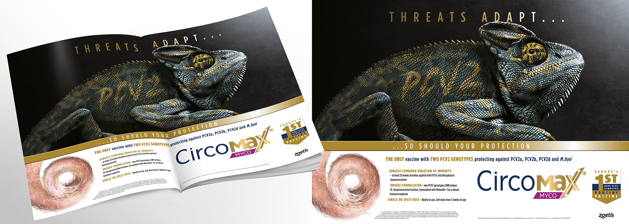
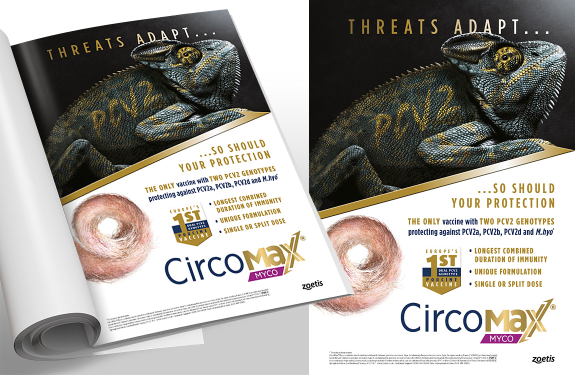
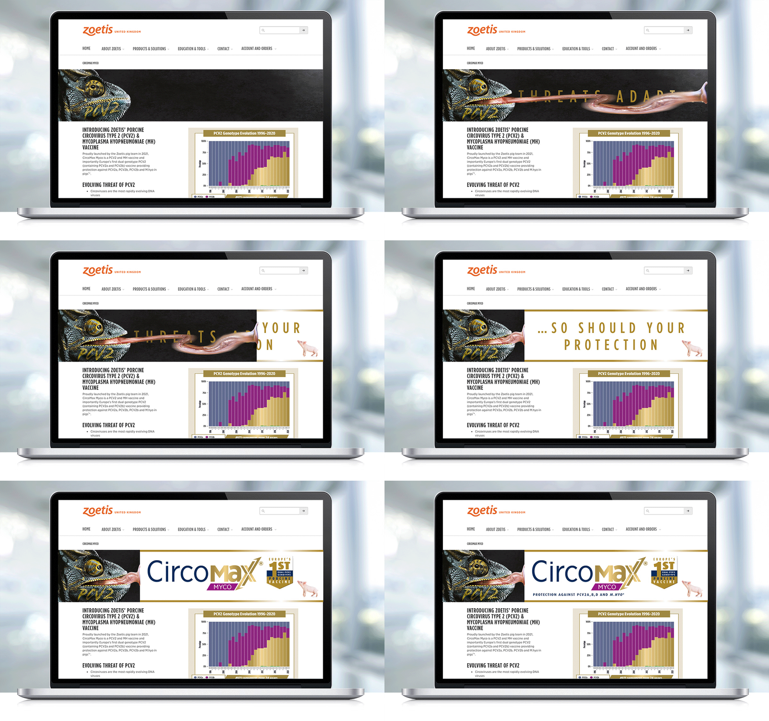
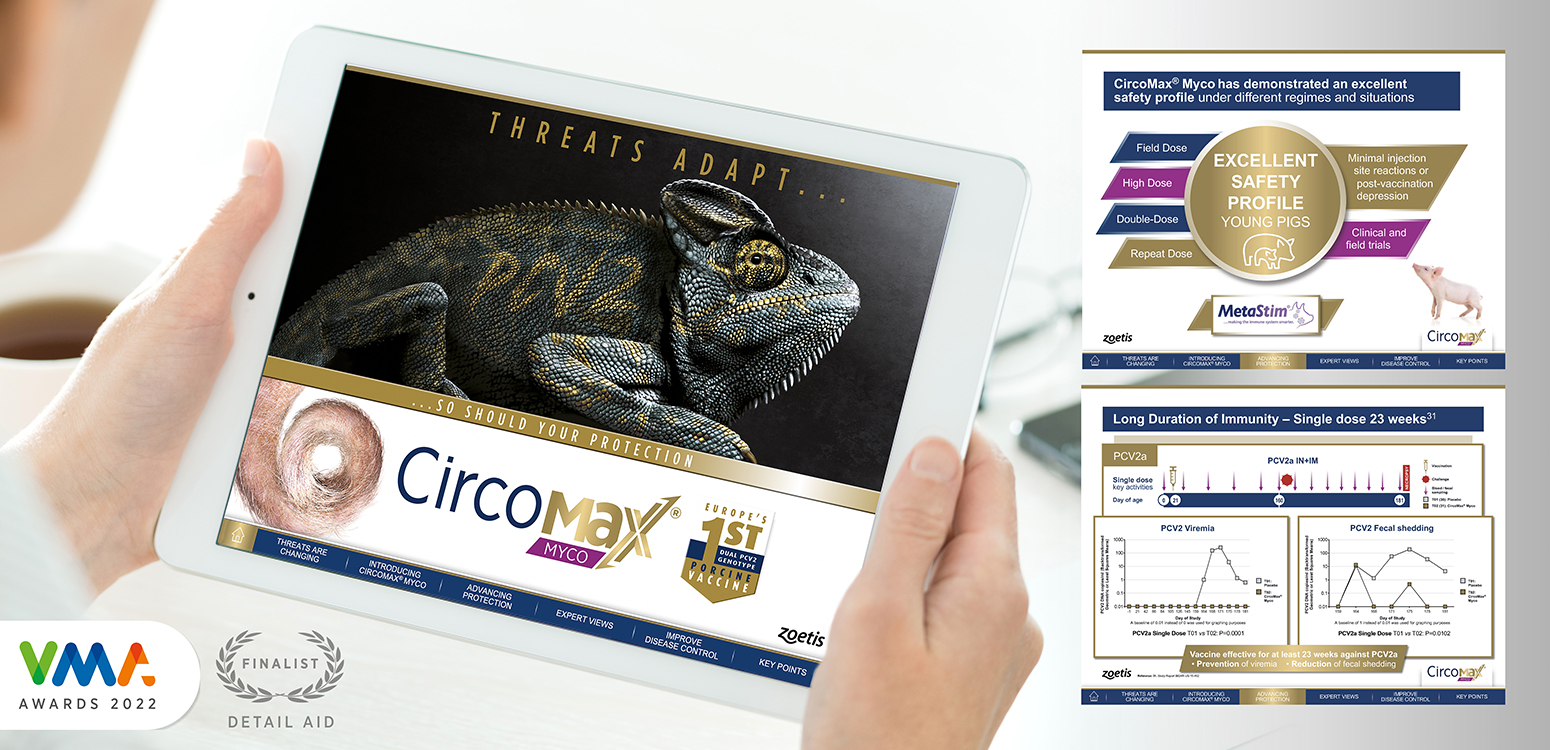
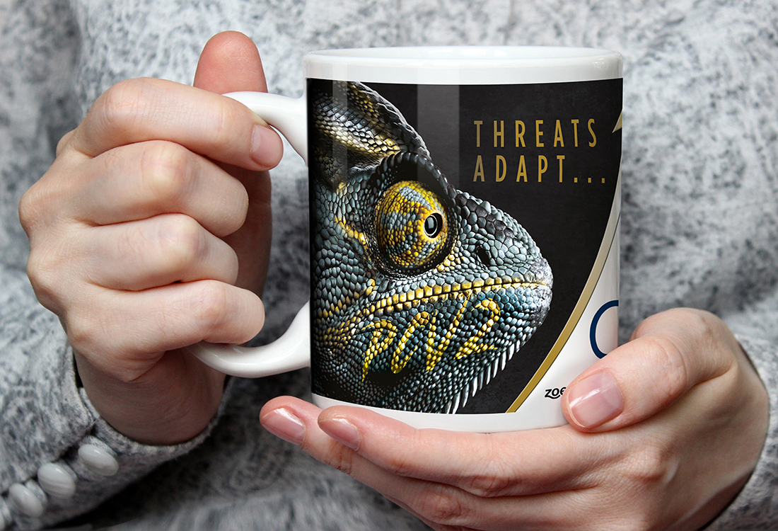
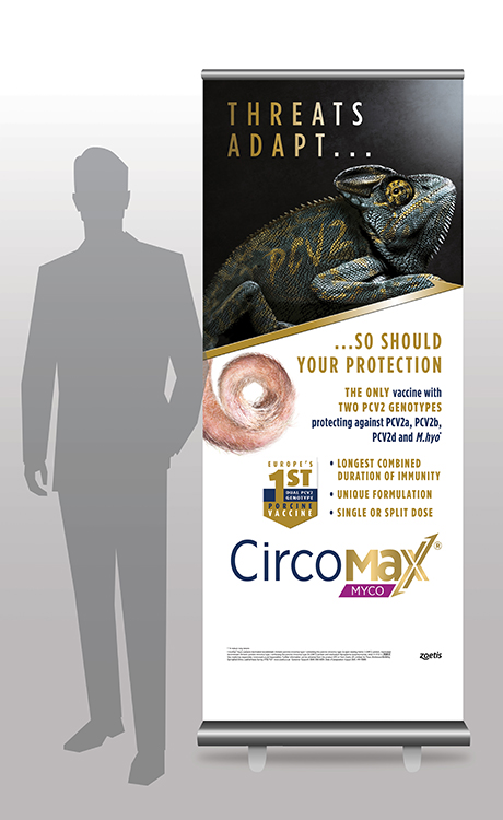
The CircoMax Myco ‘Threats adapt, so should your protection’ campaign challenges vets and producers across Europe to better understand their specific farm challenges, re-evaluate their vaccine choices in the face of ever-evolving PCV2 and recognise the benefits of unique CircoMax Myco. The Chameleon, capable of camouflage in any environment, perfectly represents the ever-evolving PCV2 virus in an arresting image, whilst the pig’s tail represents the virus-free piglet vaccinated with CircoMax Myco. In digital format, the moving eye and tongue adds a new dimension to the story representing the rapidly changing, ever-present virus watching for opportunities.

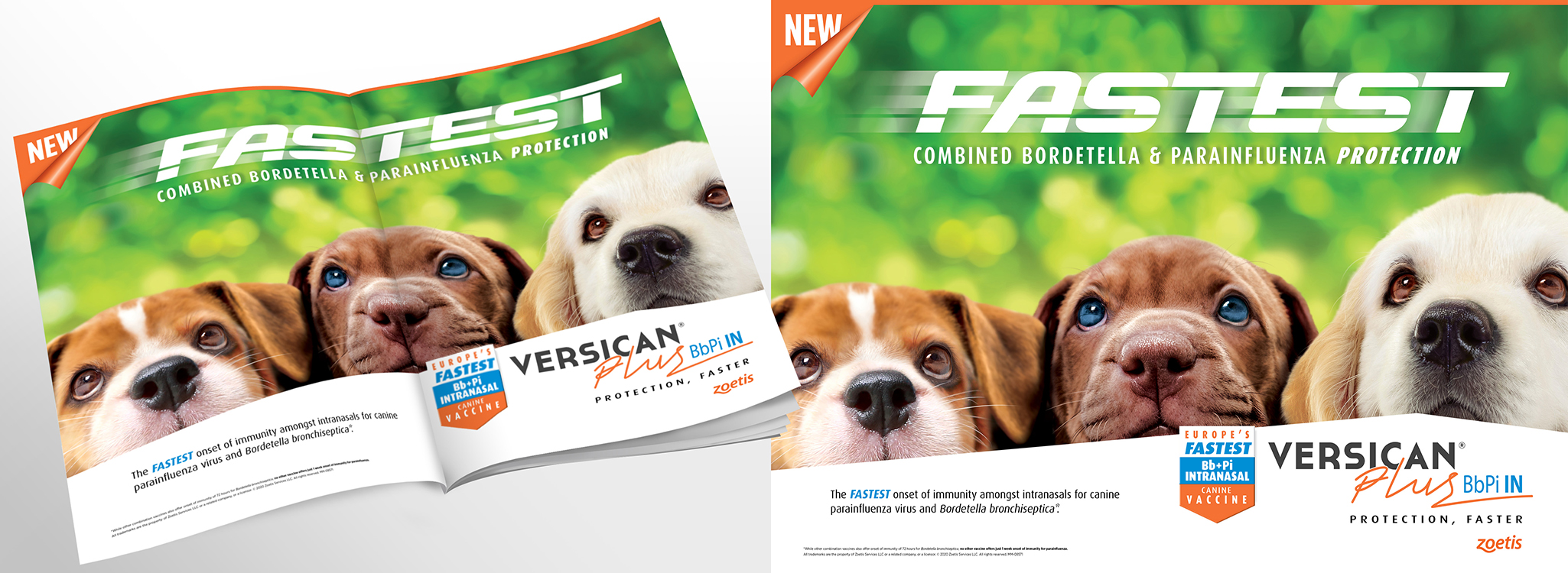
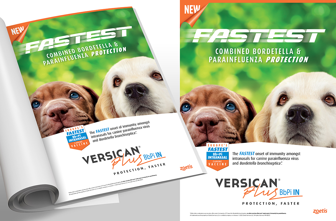
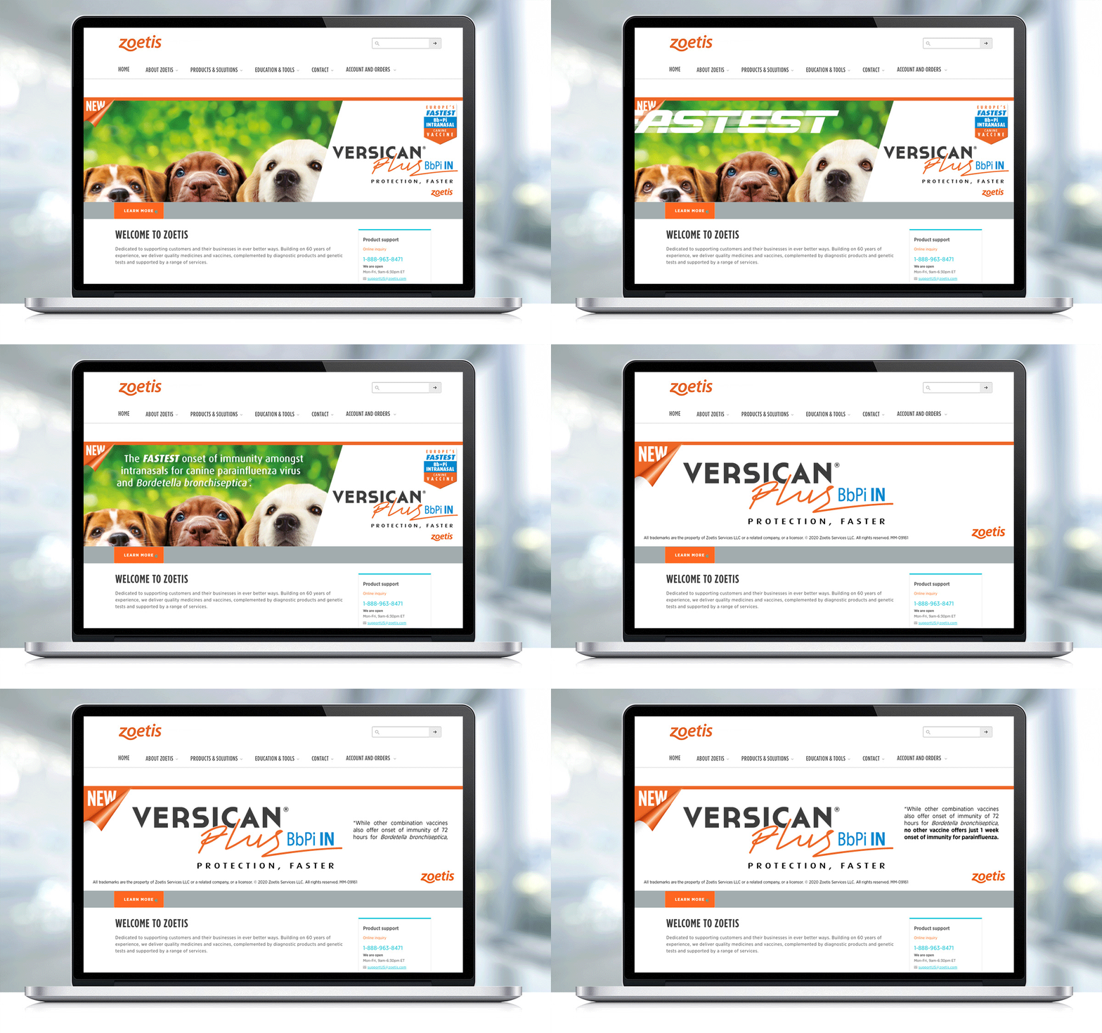
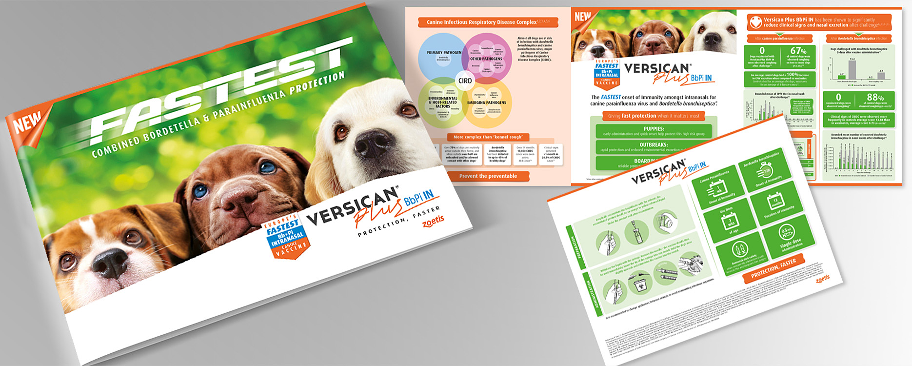
Crimson Cat were delighted to develop a Europe-wide launch campaign for new vaccine Versican Plus BbPi IN. The charming campaign features puppies lifting their noses to the vet to clearly promote the early use, intranasal administration and develop trust in the brand with an ‘ahh’ factor. The addition of movement in digital pieces sees the puppies eyes follow the title that zooms in from the side, to drive home the rapid onset of immunity. Co-positioning pieces were added to the campaign to enable vets to swiftly match Versican Plus vaccines to individual dog needs.

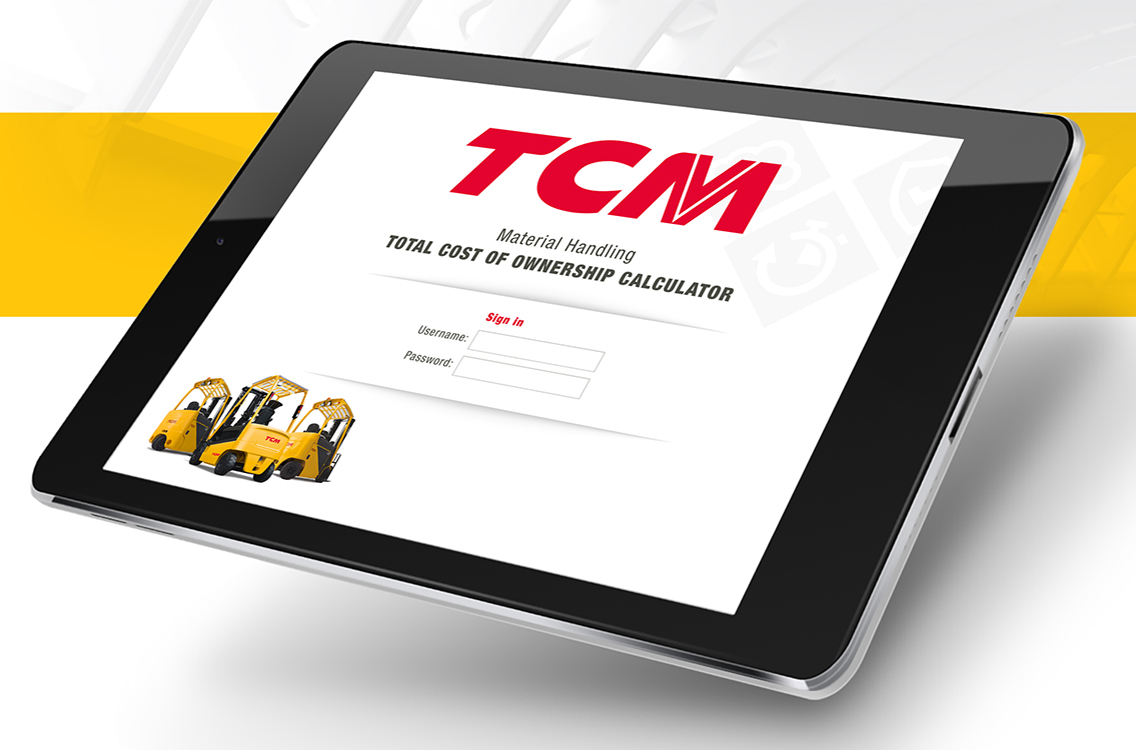
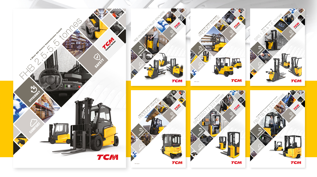
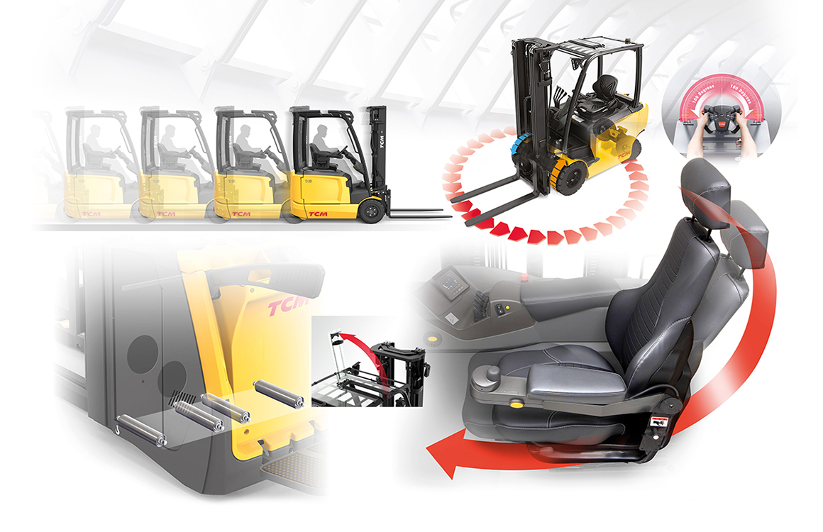
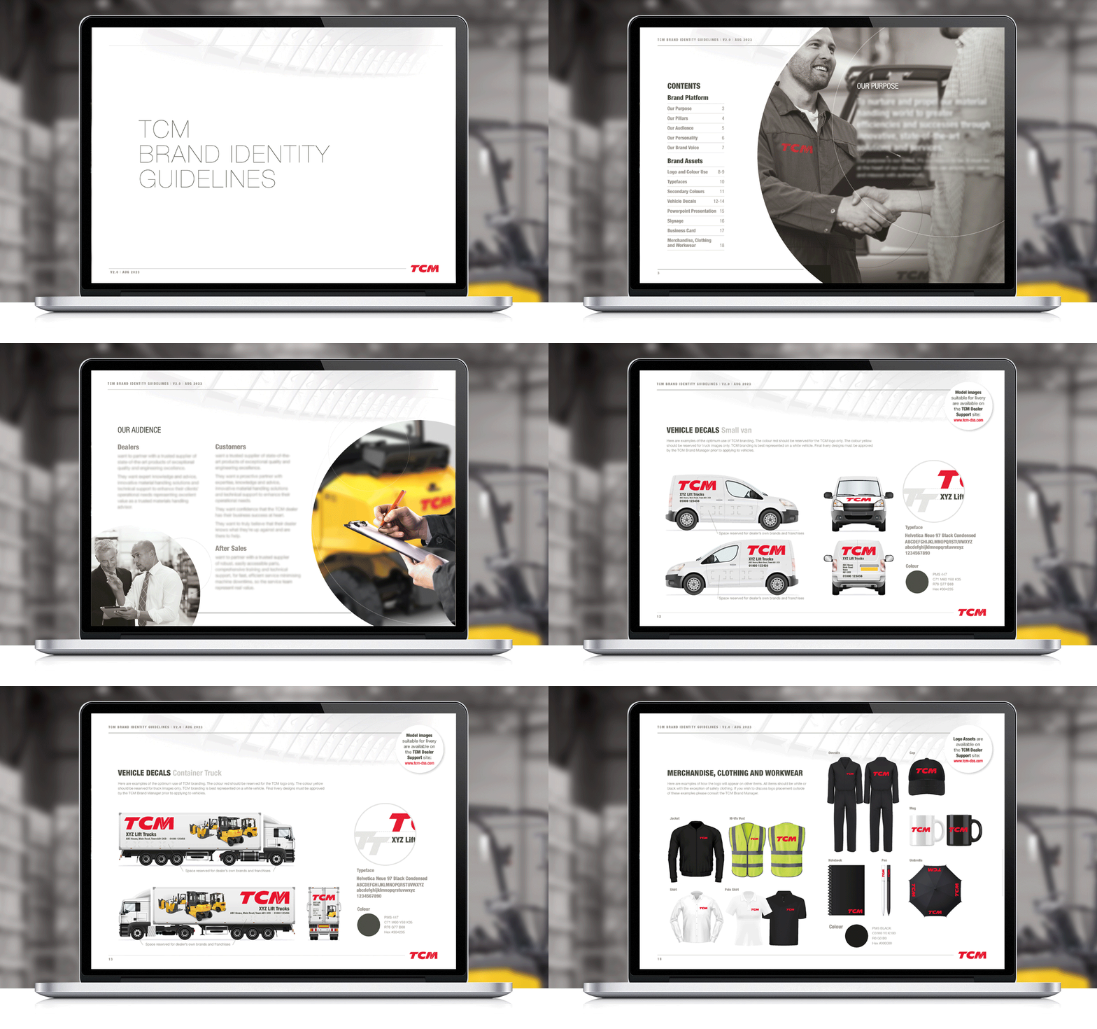
TCM, a subsidiary of global brand MLE BV, chose Crimson Cat to develop a new brand manifesto and brand guidelines, extending the changes across all corporate and sales materials. Our approach was to confirm TCM, with its enviable DNA lineage in forklift development, as a global player in the market. A fresh and confident campaign-wide new look, clarity of brand message, dynamic product imagery and informative, approachable tone of voice reflect TCM’s commitment to nurture and propel the material handling world to greater efficiencies and successes.





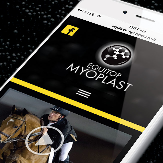
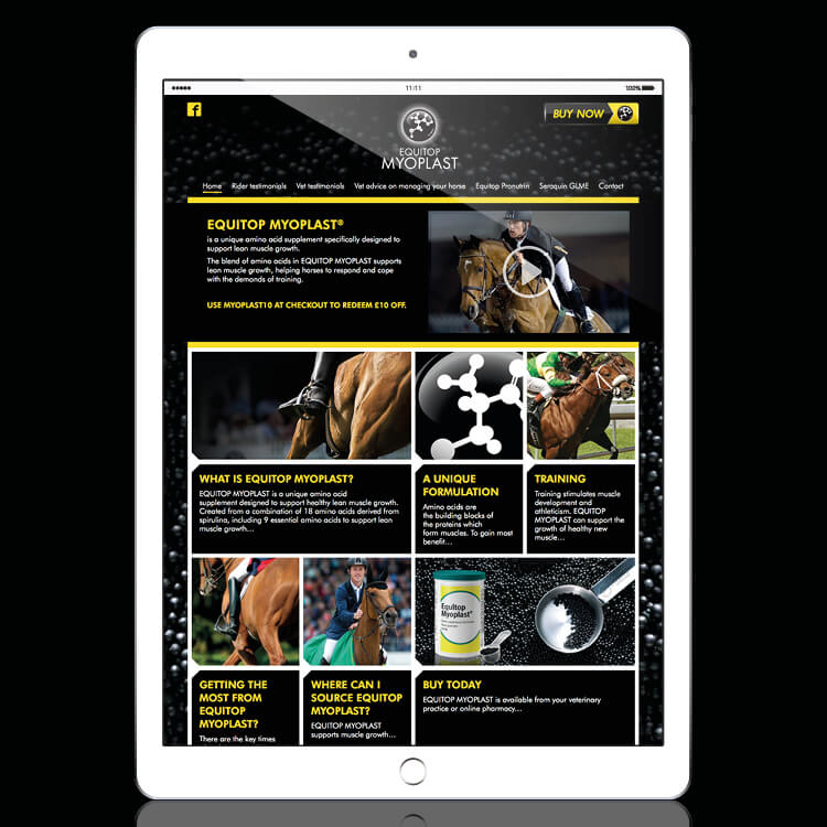
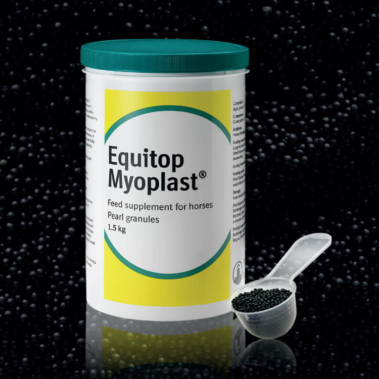
Developed from a ‘mobile first’ perspective, our award-winning website for Boehringer Ingelheim’s innovative equine supplement, Equitop Myoplast, is delivering more effective online communication with the brand’s digitally active consumers. Vibrant branding, clear navigation and extensive use of video to communicate leading rider endorsement and vet support, the new site has led to a dramatic increase in traffic and is building more in-depth relationships with the UK’s horse owners online.

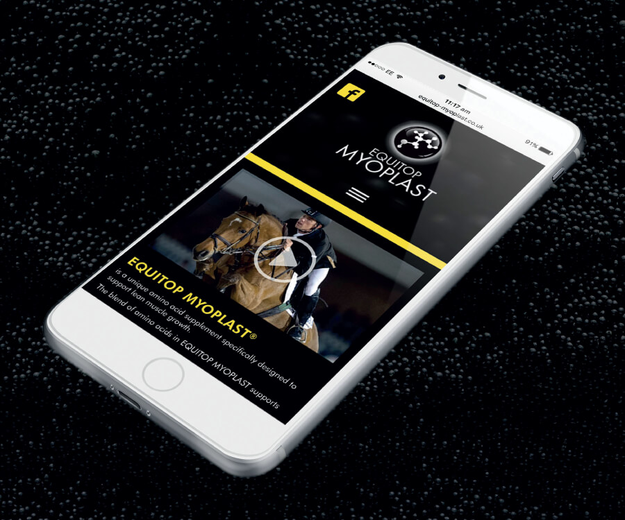
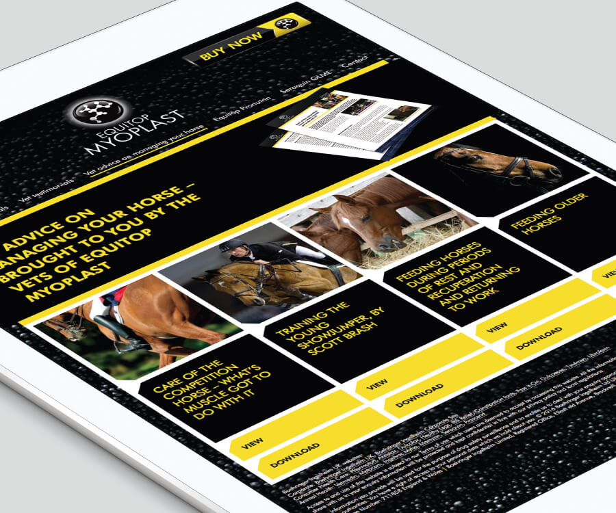
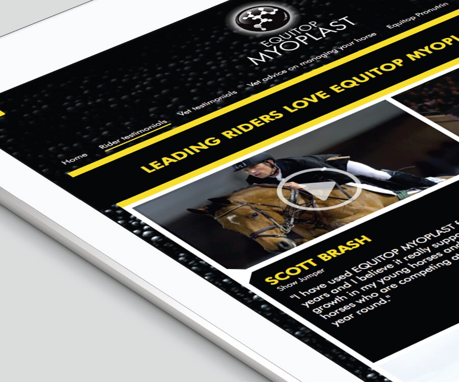

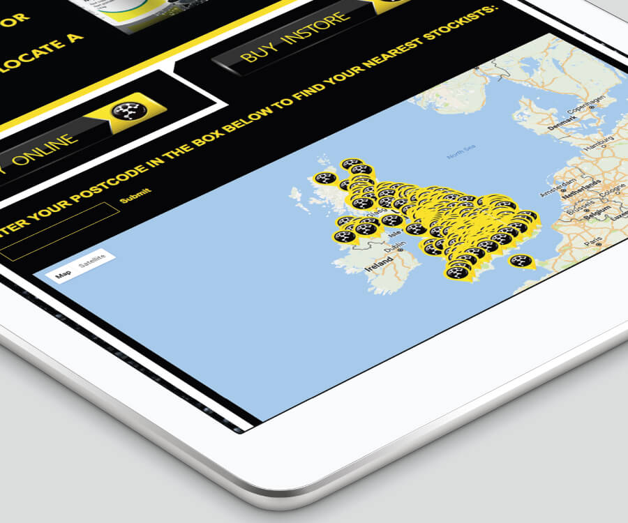
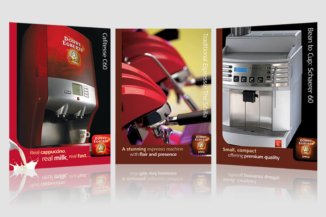
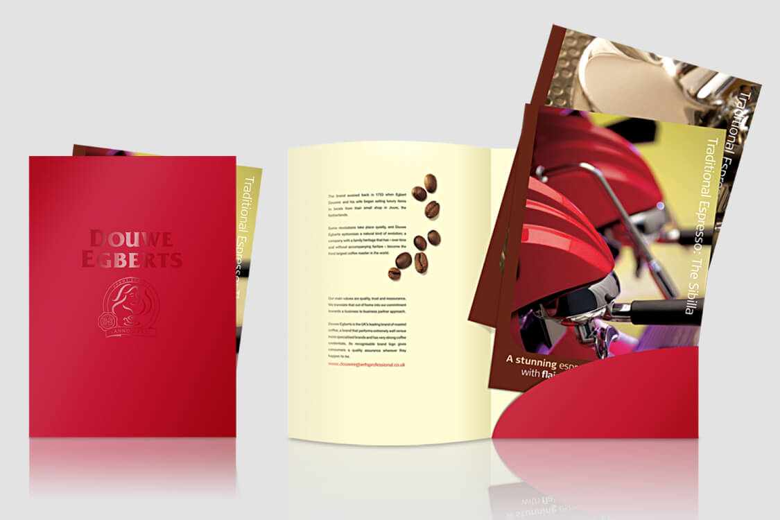
Crimson Cat developed stylish sales materials across Douwe Egbert’s expansive coffee systems range of machinery, as well as conference support including location search, delegate engagement, scripting, production and full event day management. All our support focuses on the ultimate style and high caliber of the Douwe Egberts brand.

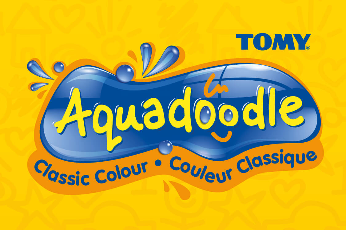
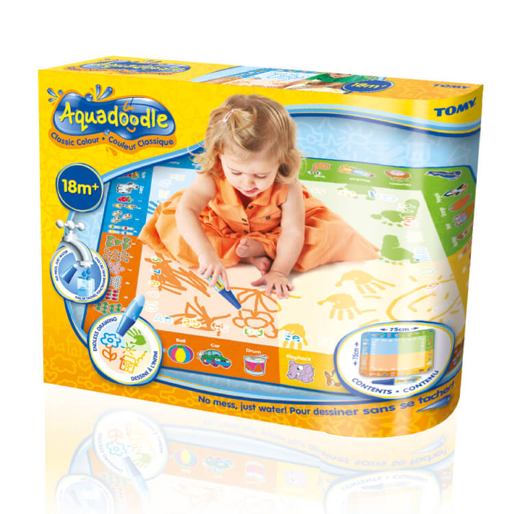
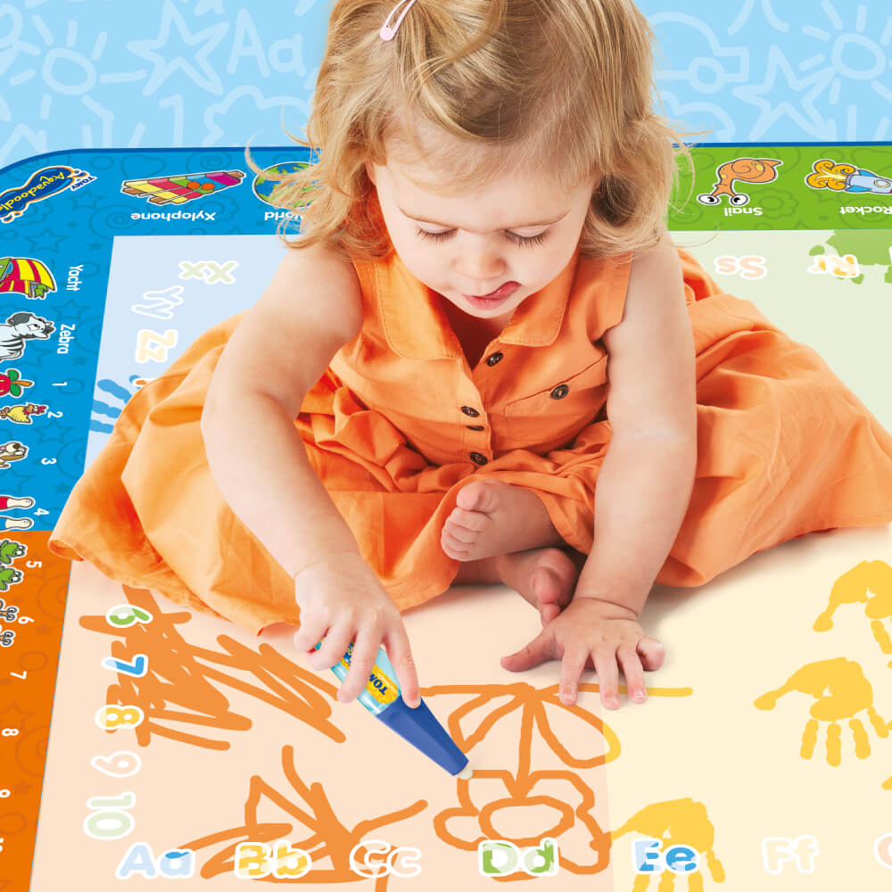
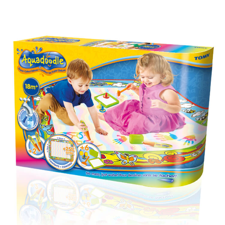
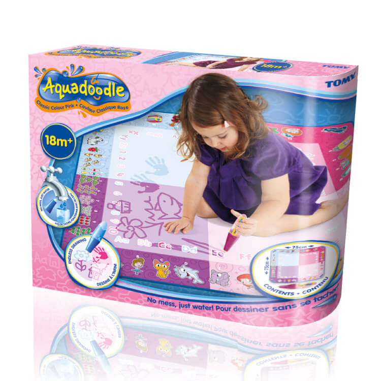
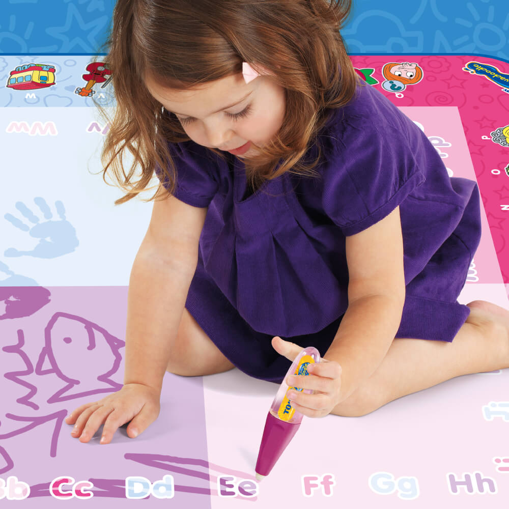
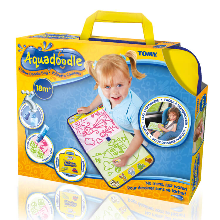
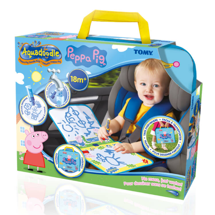
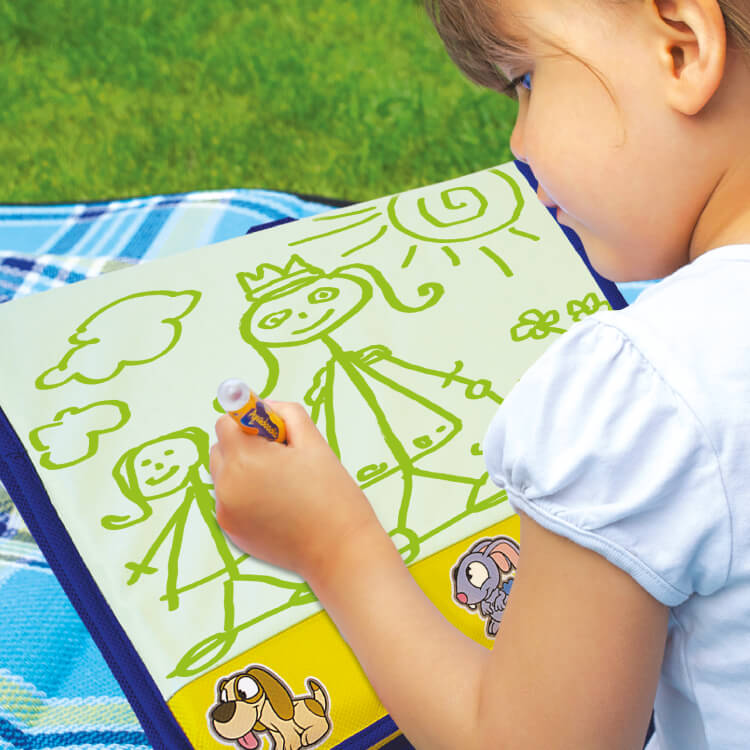
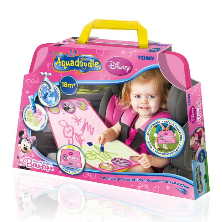
Crimson Cat were invited to update the global branding for preschool creative toy, Aquadoodle. The new branding promotes the fun, mess-free, colourful and creative focus of the brand. The new brand logo typography and on-pack doodles were created using the real Aquadoodle water-filled pens. For on-pack imagery our team spent hours of fun engaging our young models with these outstanding products, which made our photographic selection very easy. TOMY were delighted with the end result and the bright, fun new branding has reclaimed market leading presence on-shelf.
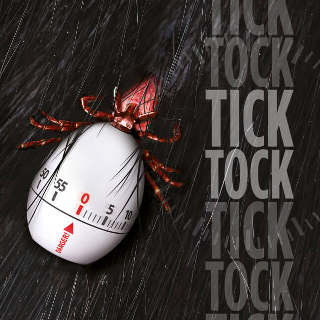
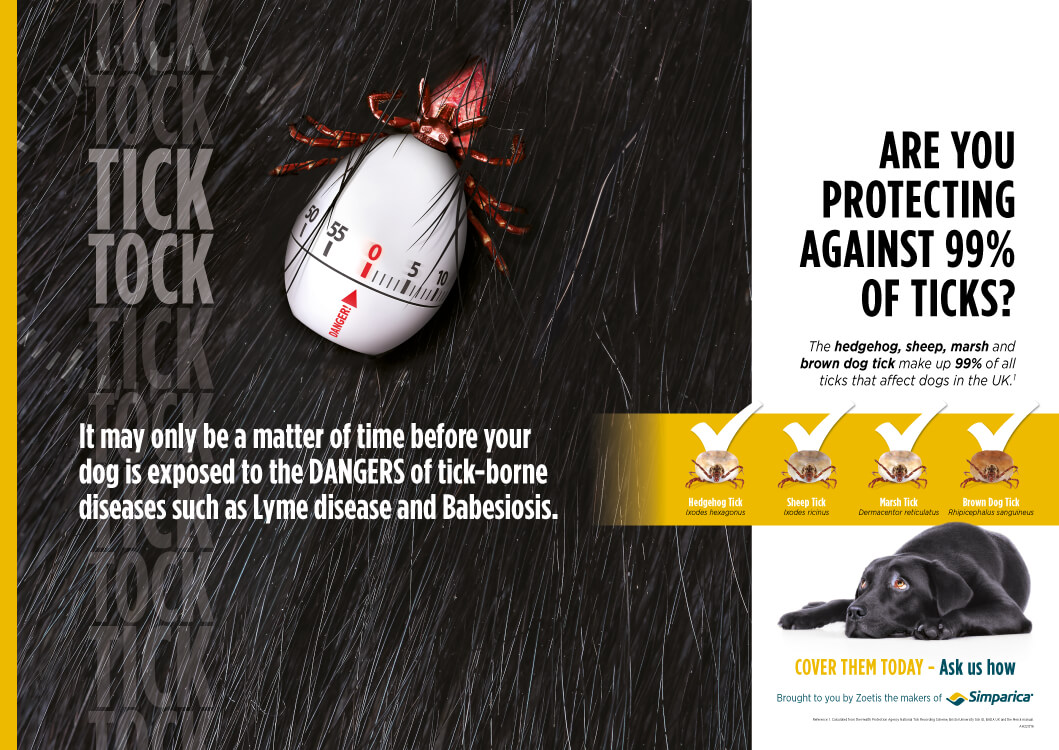
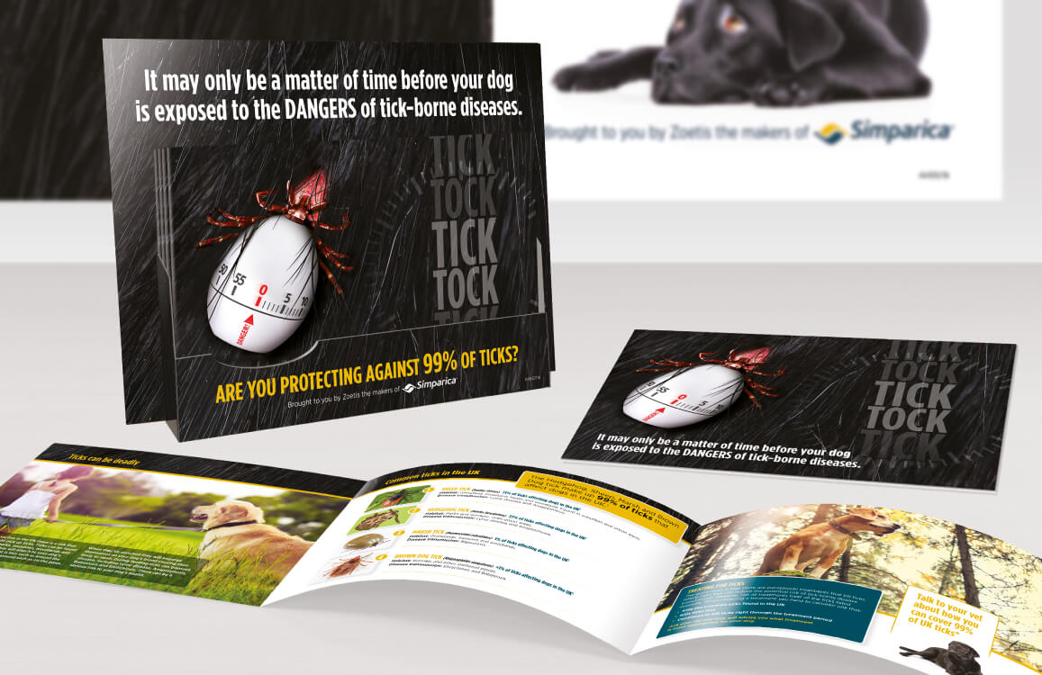
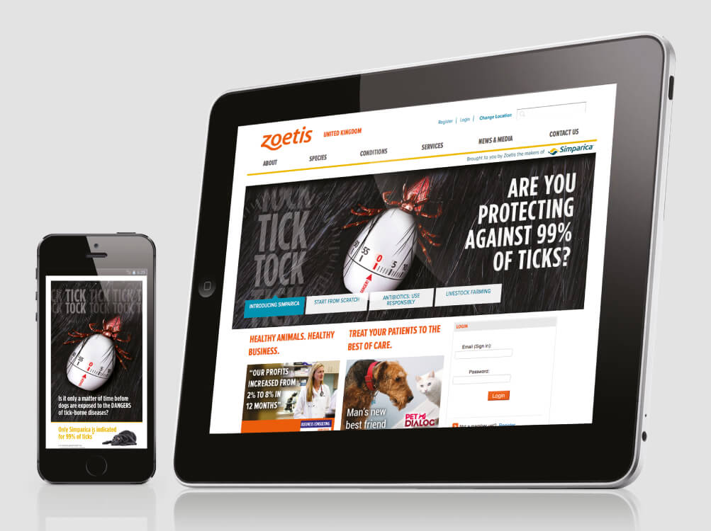
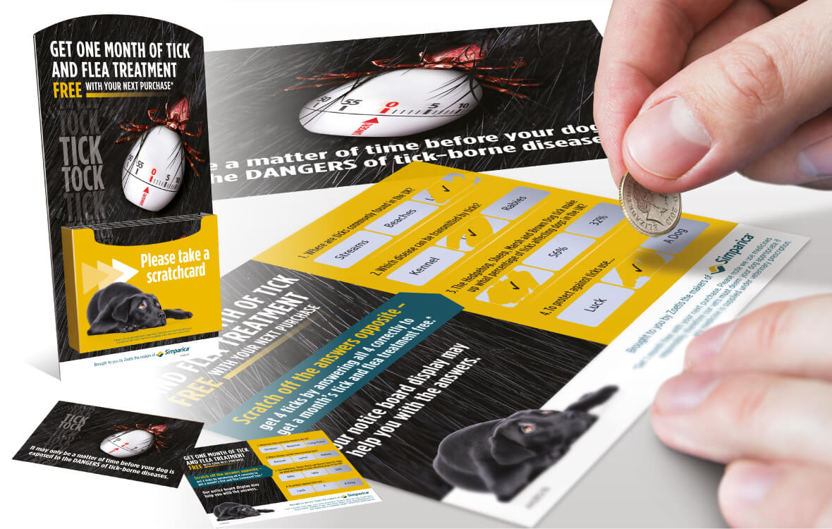
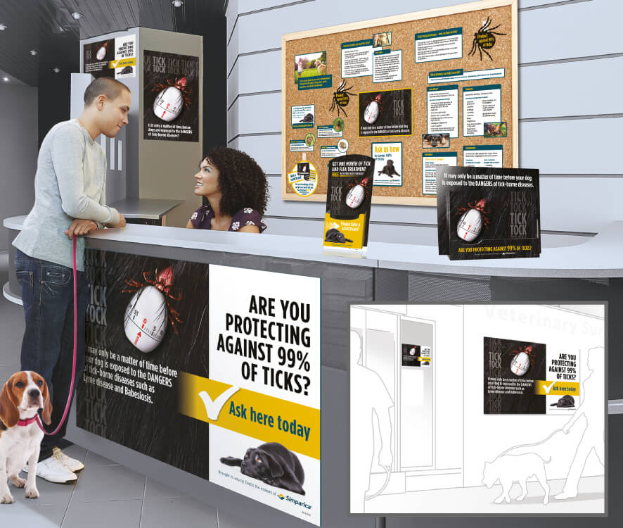
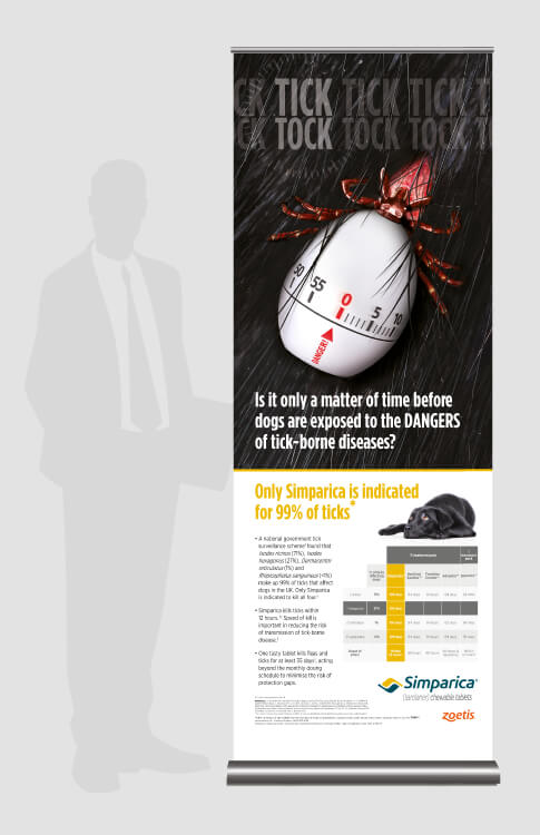
The ‘Tick Tock’ campaign with it’s highly impactful ‘Tick-ing Timer’ graphic, promoted the dangers that ticks and tick borne diseases bring to the nation’s dogs, and perfectly positioned Simparica as the product of choice. With distinctive, engaging and award-winning point of sale the campaign played a major role in supporting the launch of Simparica, the innovative parasiticide for dogs. Additional campaign elements included advertising and sales support materials.
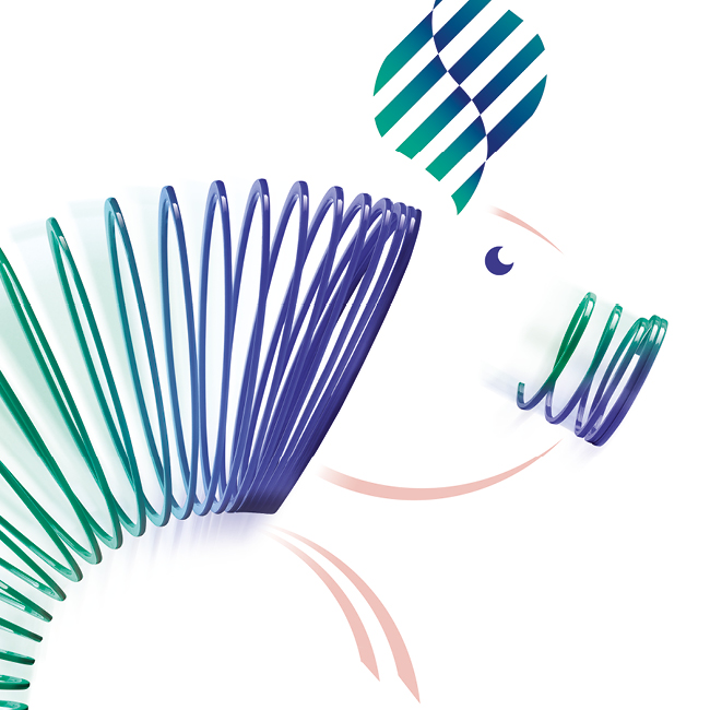
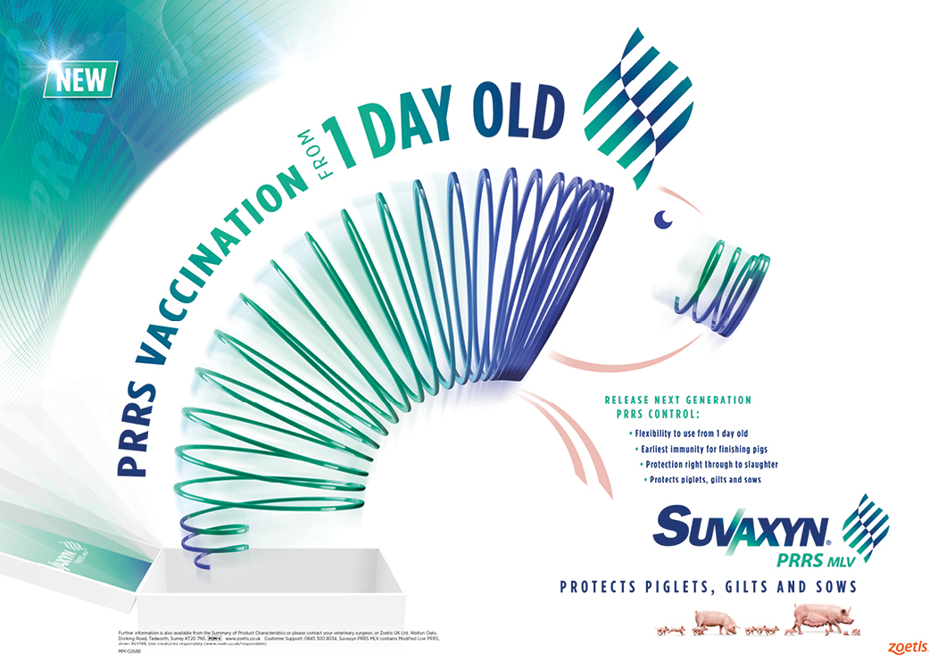
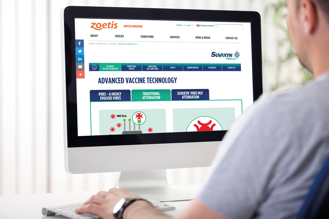
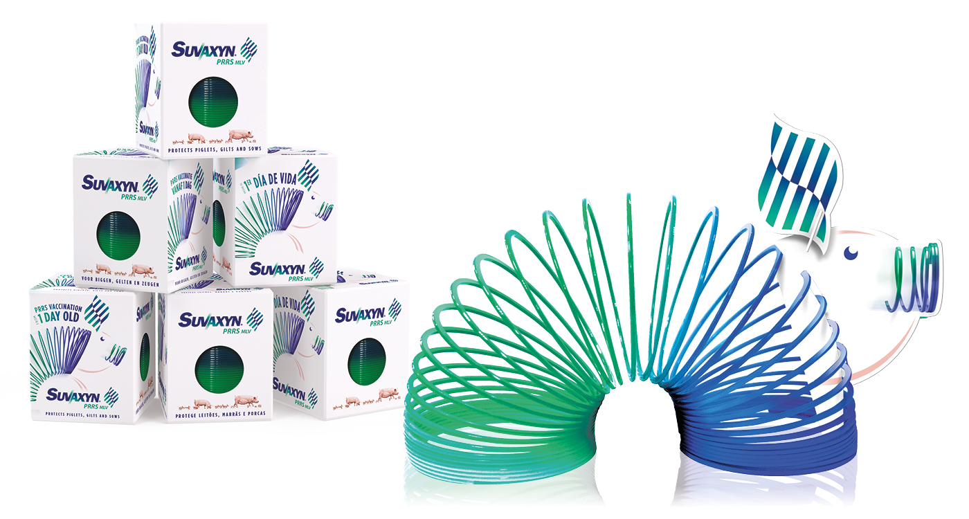
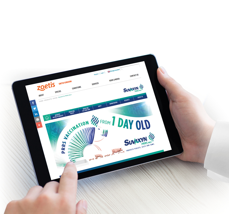
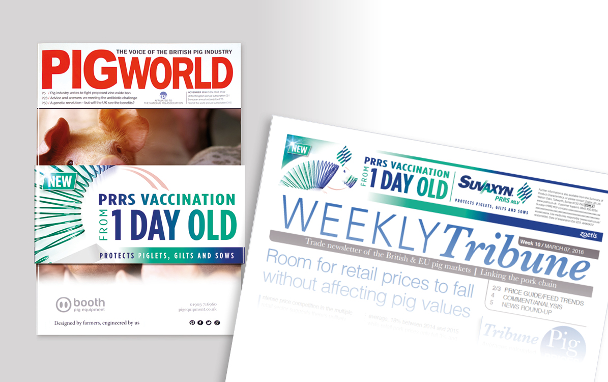
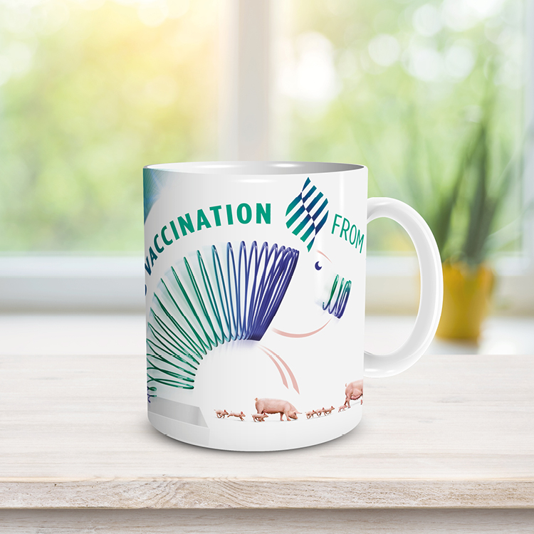
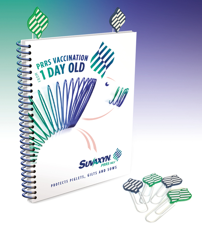
Developing a launch campaign to work across Europe is never easy, but Zoetis are delighted with Crimson Cat’s campaign to launch this ground-breaking vaccine in to the swine market. With a strong emphasis on the product’s unique 1 day of age application combined with impactful and memorable imagery, the campaign is promising to deliver strong sales across Europe. Elements include brand image, advertising, eDetailer, website, farmer and vet literature and promotional items.

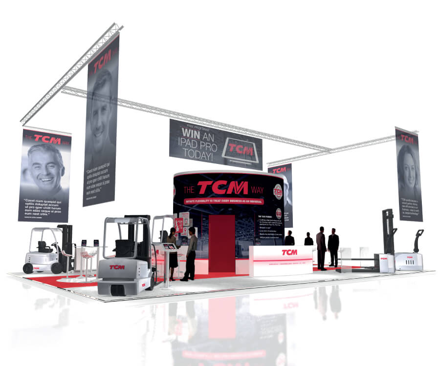
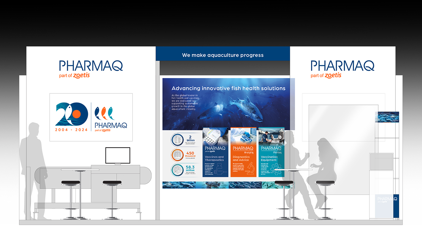
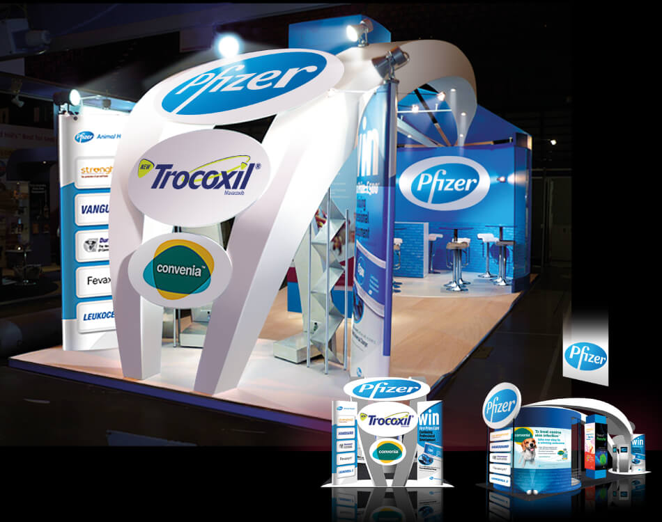
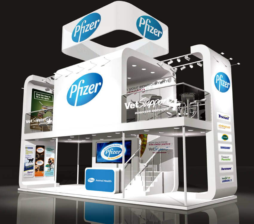
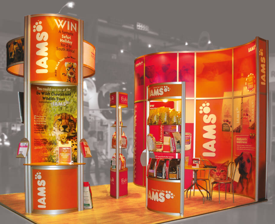
Crimson Cat strive to deliver outstanding show stands. From drawing thousands with on-stand theatre at Europe’s premier intralogistics show to stands for giants Pfizer, PHARMAQ and P&G, visitors should always recognise a tangible difference on arrival. Crimson Cat’s clever use of stand space, creativity and extensive attention to detail ensure stands successfully achieve their objective every time.








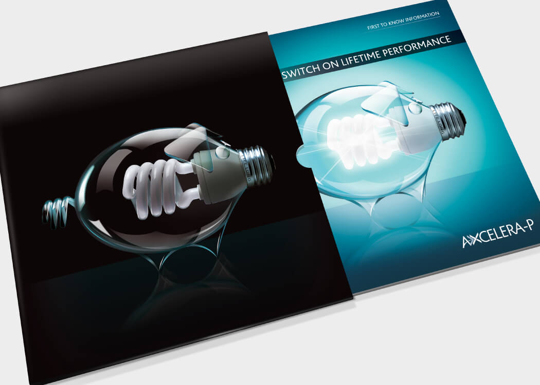
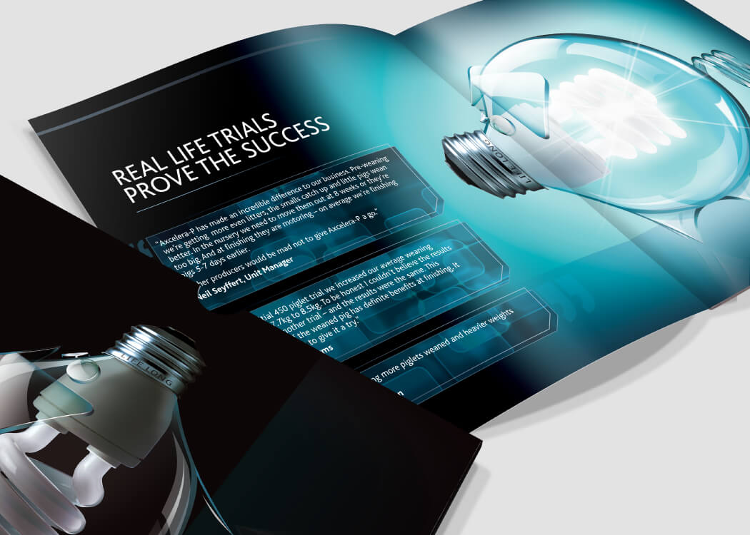
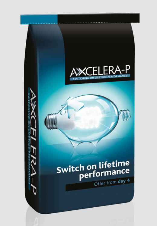
AB Neo, a division of AB Agri, were delighted with Crimson Cat’s launch concept for their exciting new breakthrough product for pigs. The launch campaign perfectly distilled the dramatic effect that this accelerator product offers the world-wide pig industry. The campaign included marketing strategy, full branding, press and digital advertising, first-to-know materials, brand reminders and packaging.


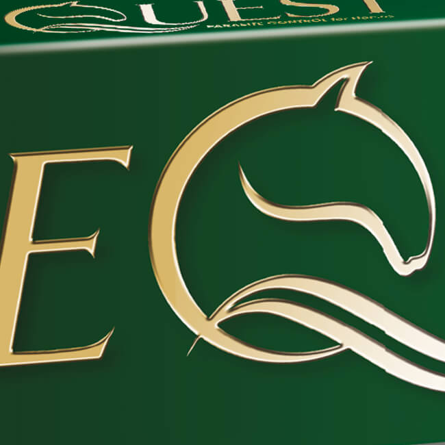
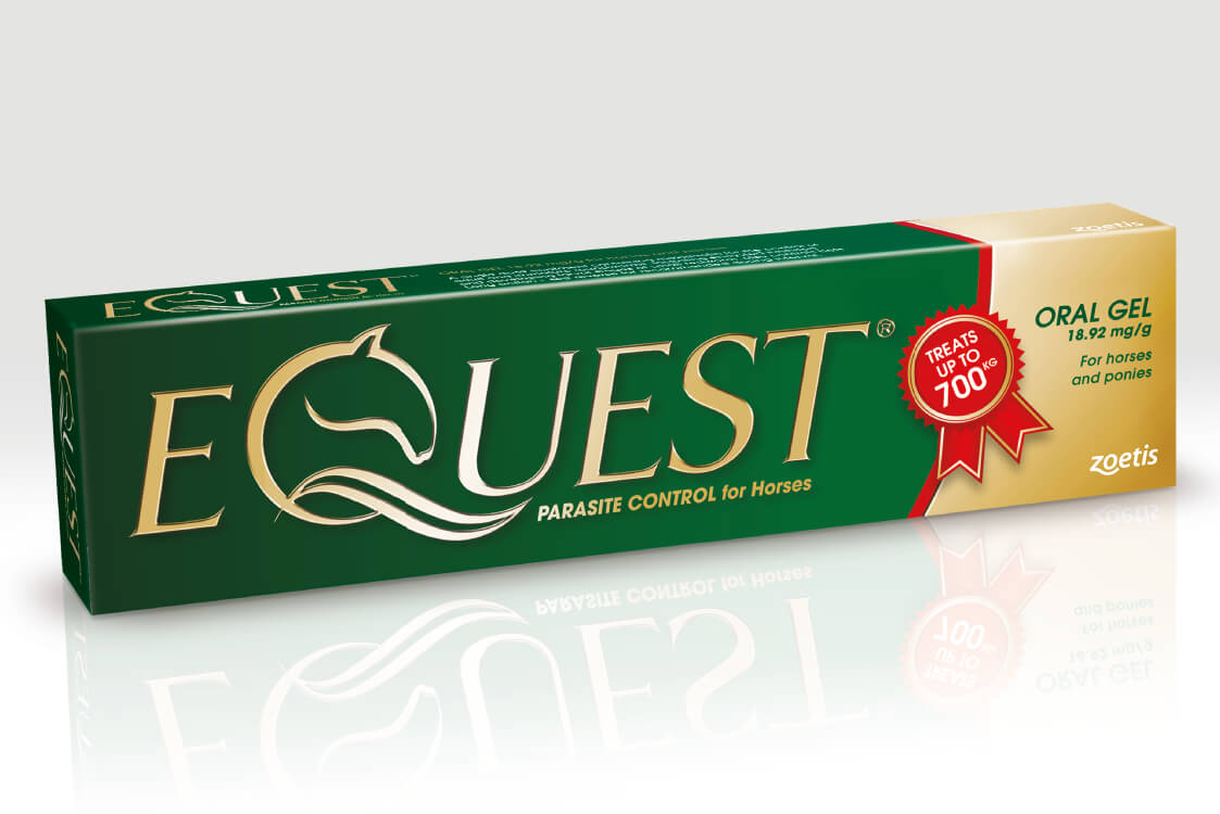
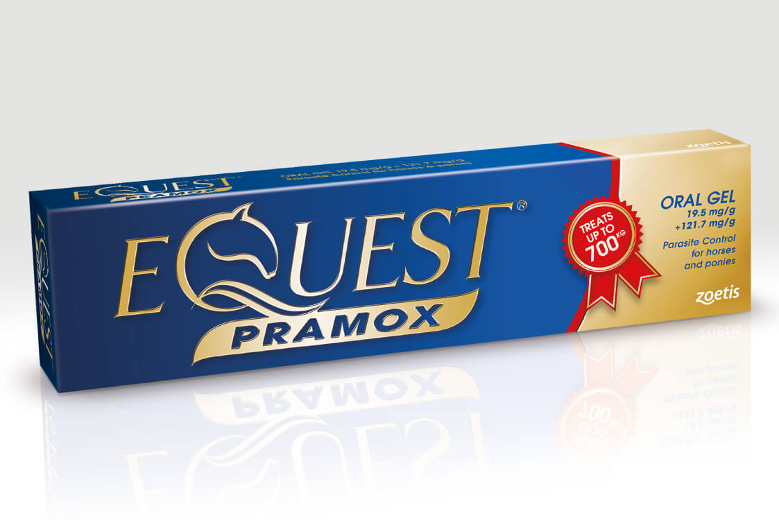
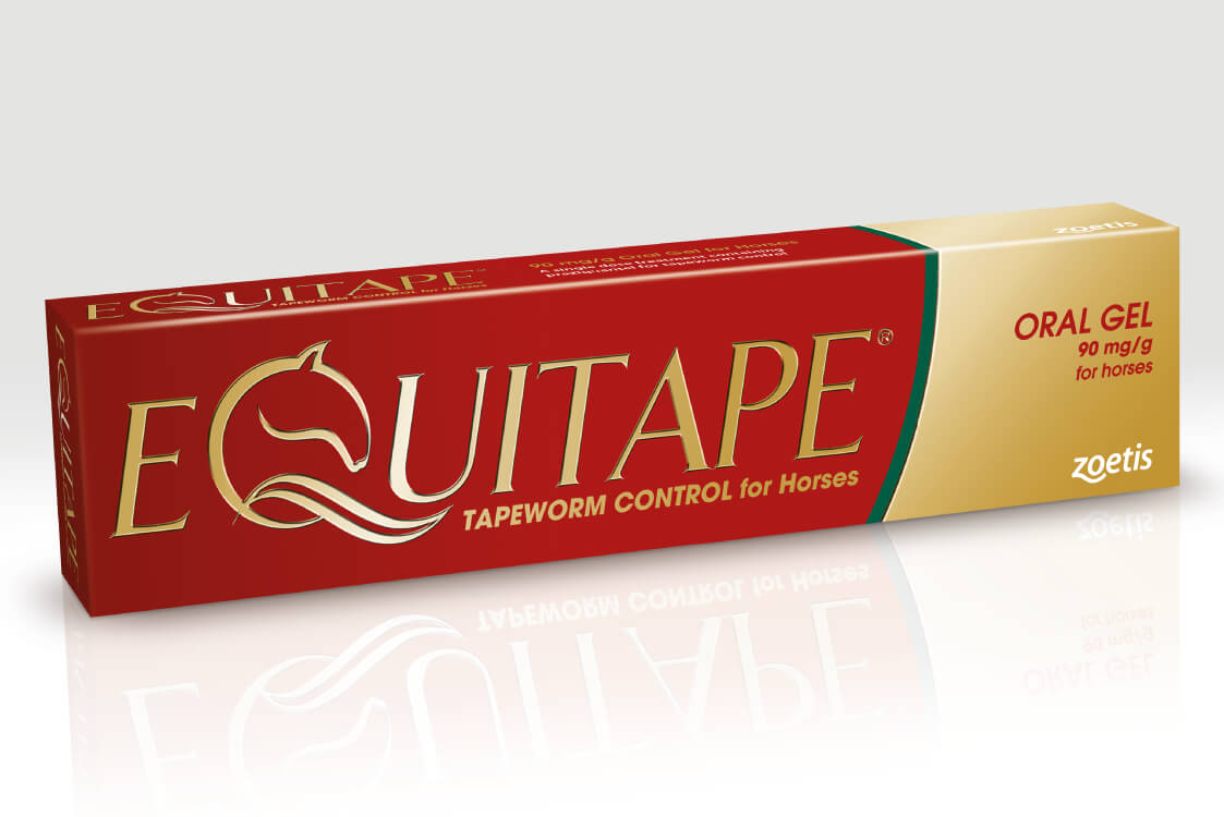
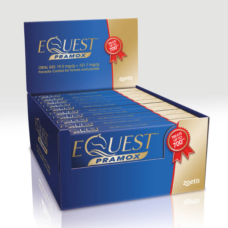
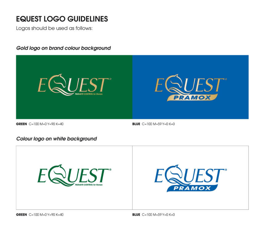
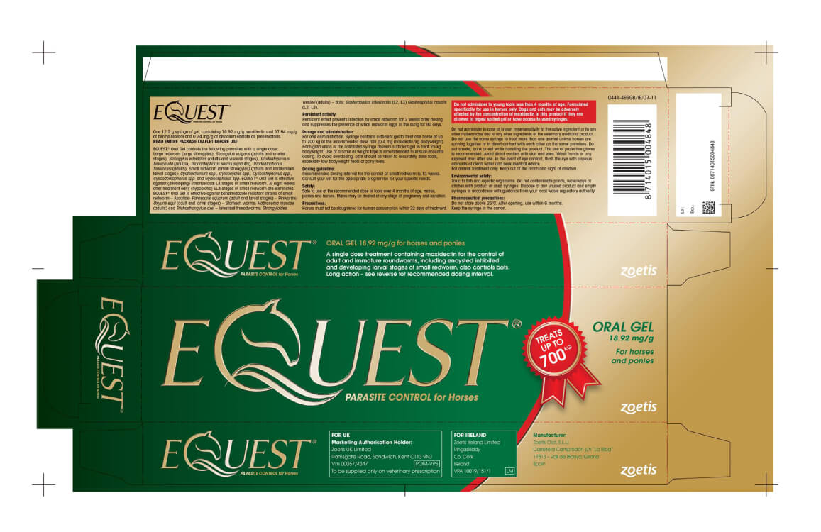
Crimson Cat were commissioned to update the European packaging and branding for market-leading oral gel for horses and ponies Equest and partner brands Equest Pramox and Equitape. The branding is fresh and impactful whilst retaining enough of the brand identity to encourage customer recognition. Equest’s iconic green and gold colours are now brighter and reflect movement in the background. The new brand logo features a striking ‘Q’ icon in the style of a horse’s head, mane and tail. Although printed in only 5 colours, the new logo is illustrated as gold foil blocking to enhance this premium, iconic brand.

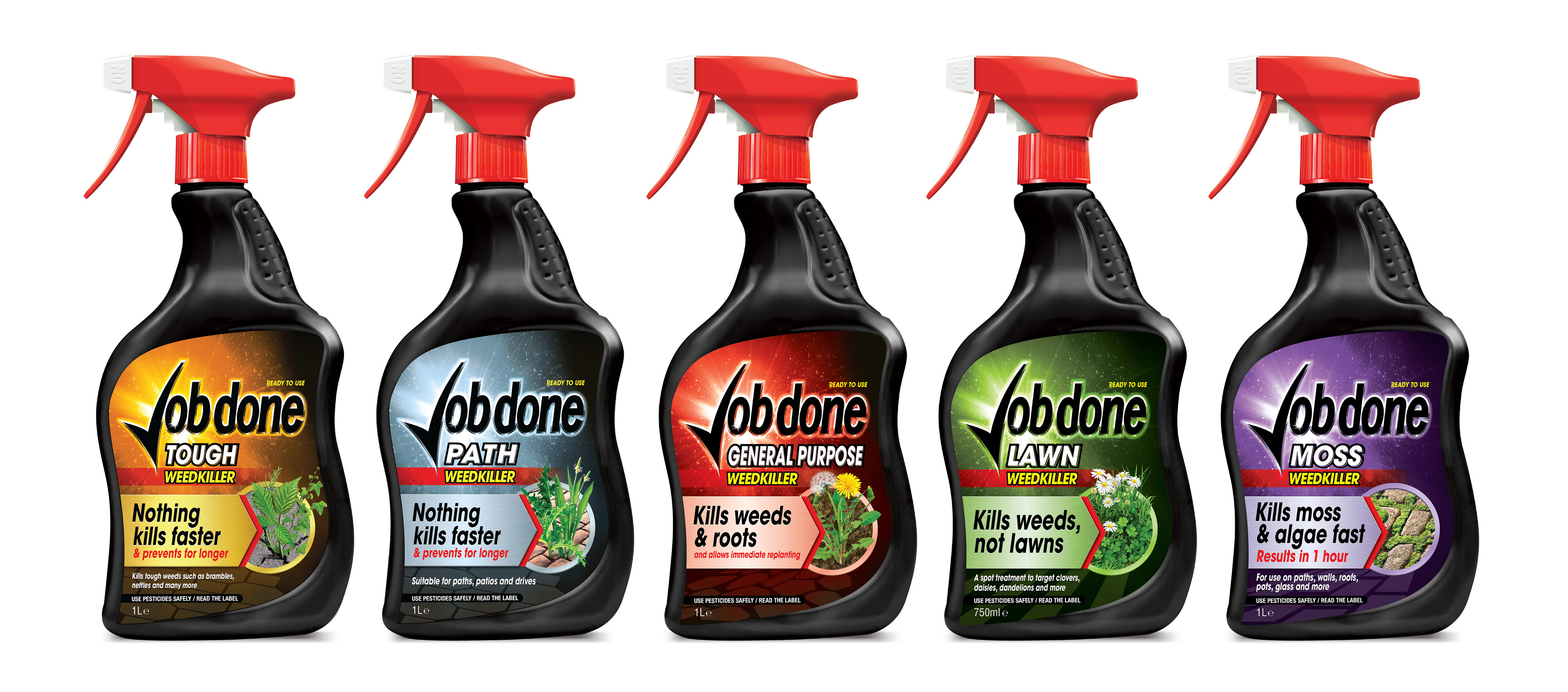
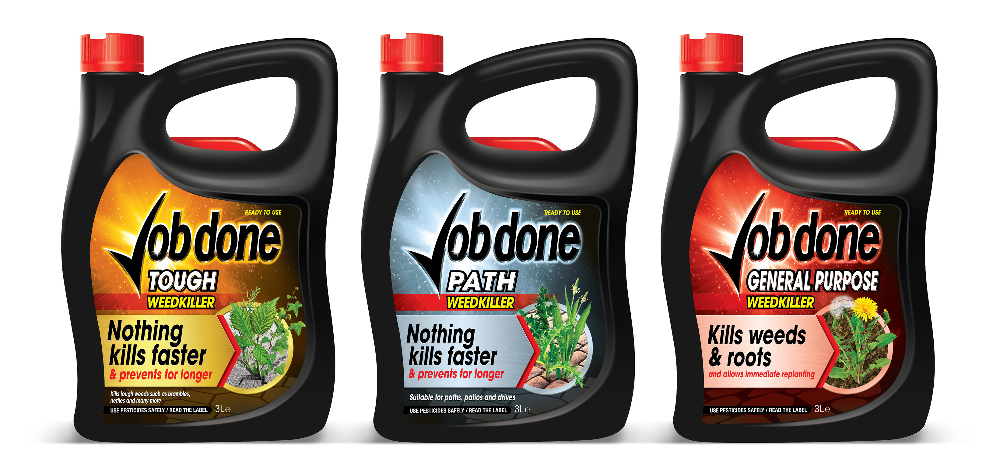
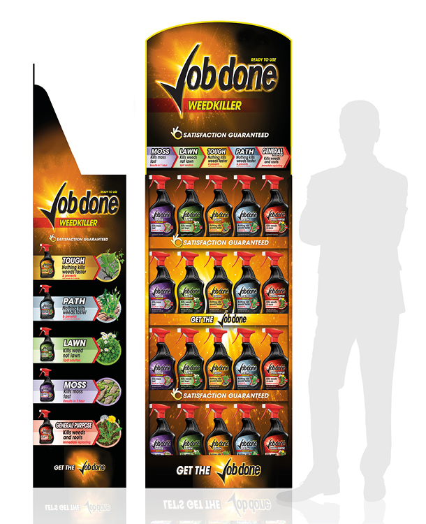
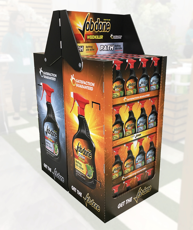
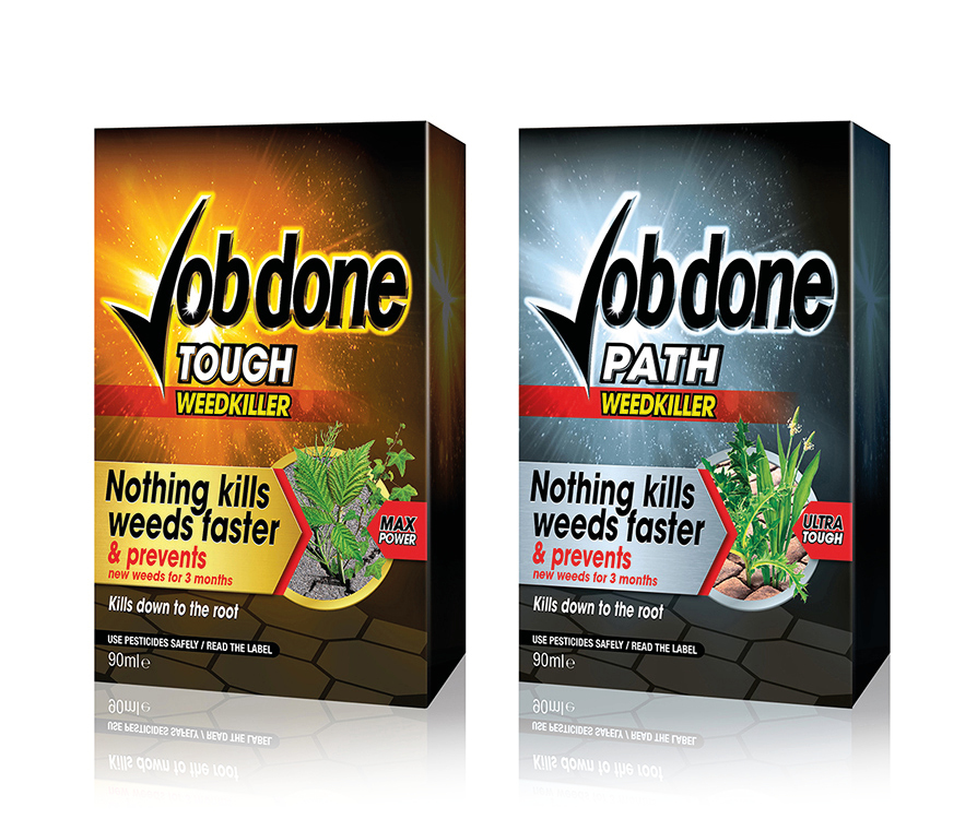
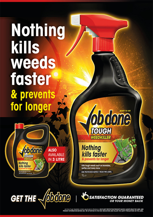
When SBM Life Science wanted to launch an exciting new weedkiller range that could cut through the clutter of existing labels, they turned to Crimson Cat. We created a powerful and dynamic brand identity across the range of 5 product variants and 15 SKUs. Crucially the vibrant, no nonsense branding commands attention on shelf whilst clear messaging perfectly delivers the core brand benefits and reasons to purchase. The project extended to eye-catching POS, display outers as well as trade advertising and trade-to-consumer promotional advertising.
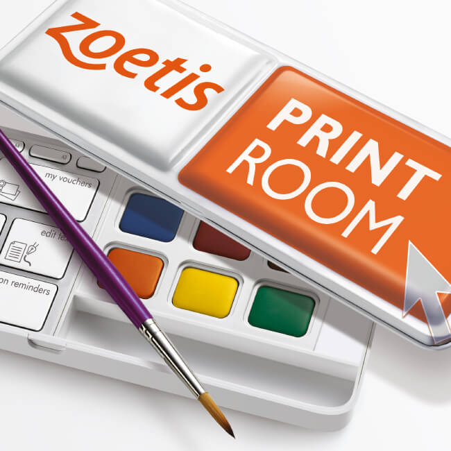
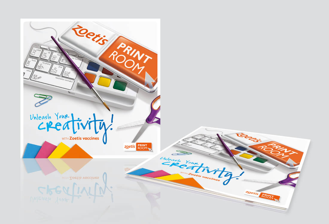
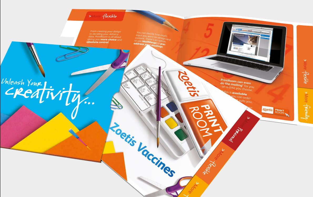
Crimson Cat created, launched and ran a dazzling PrintRoom service for Zoetis, the world’s largest animal health company. The online portal allowed veterinary vaccine customers to personalise a portfolio of materials and add their own creative flair. Ease of use and an encouraging helpline saw customer interest surge and converted new vaccine customers. The campaign includes advertising, direct mail, website, literature, print and full time helpline.


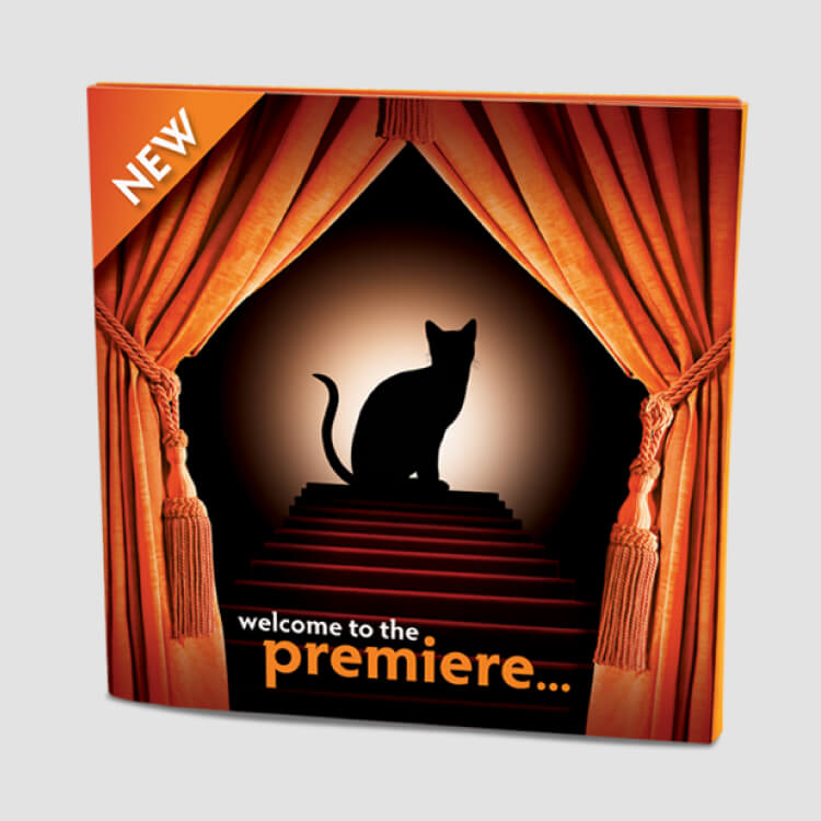
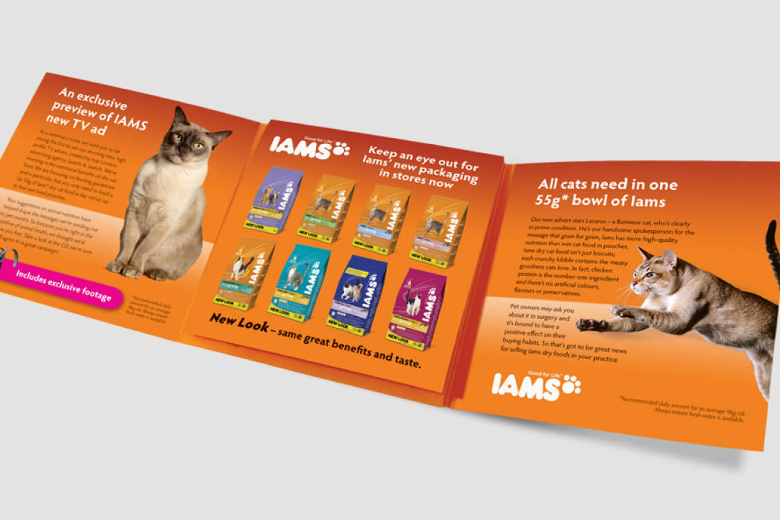
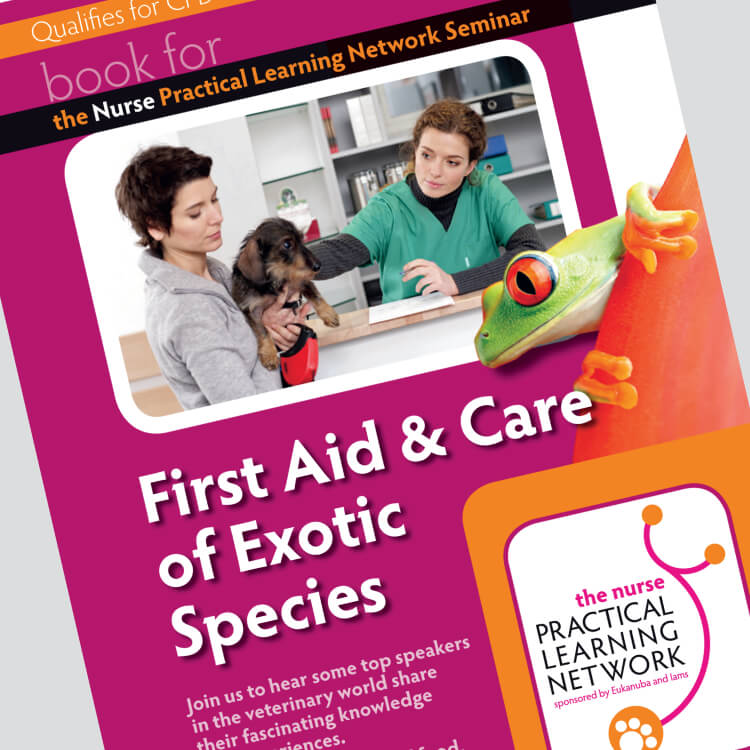
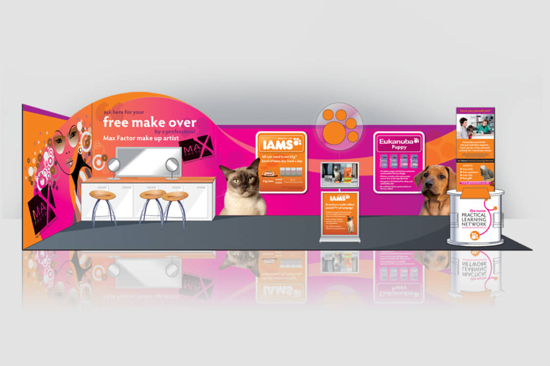
IAMS and Eukanuba are leading innovators in the pet food market; our extensive support for these respected brands included show stands, direct mail campaigns, seminar materials and launch branding and materials for their ground-breaking ‘The Nurse Practical Learning Network’, developed for veterinary nurses nationwide.



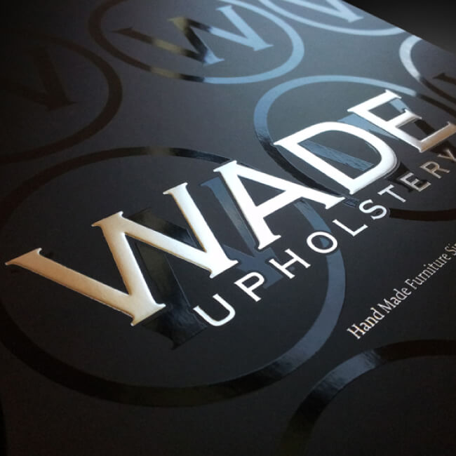
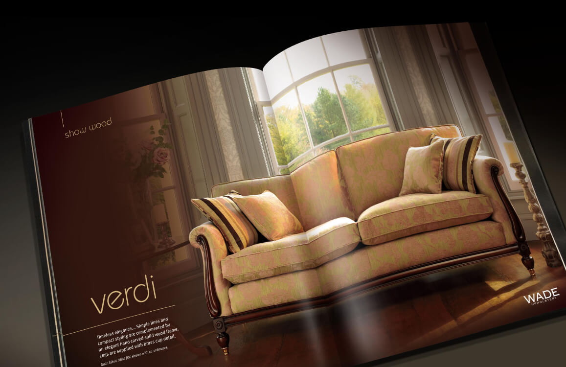
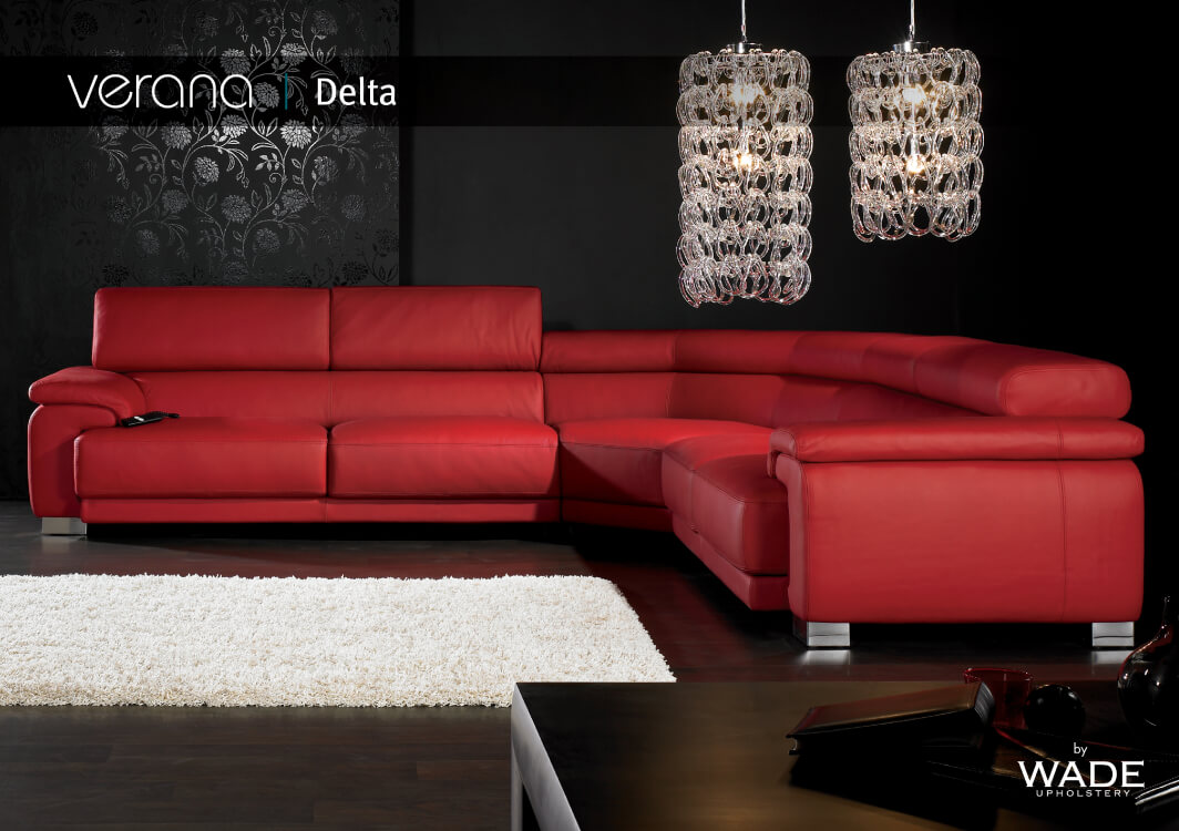
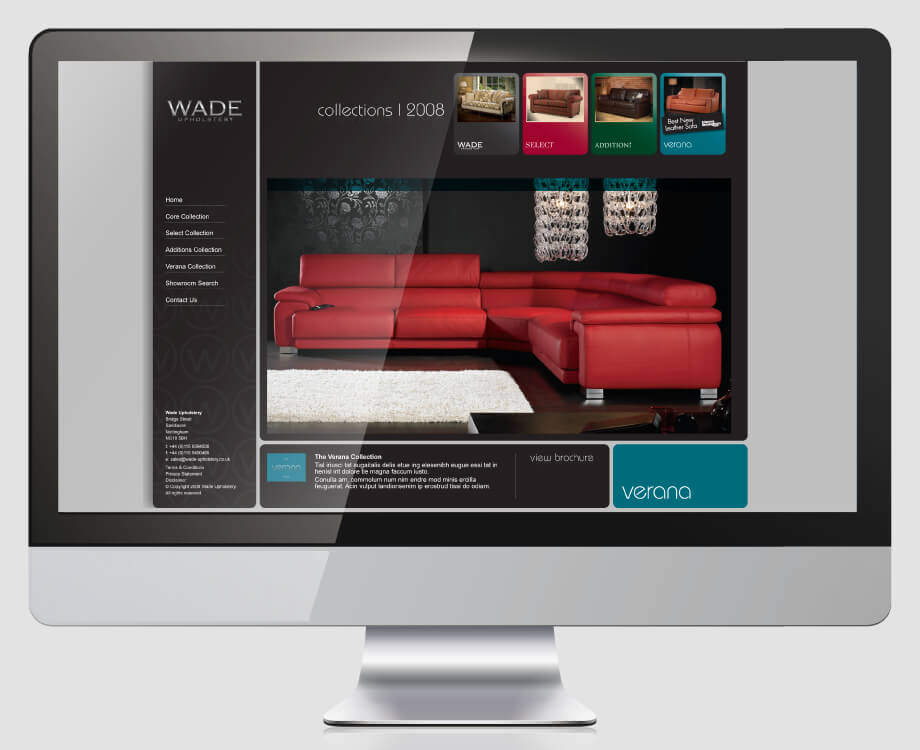
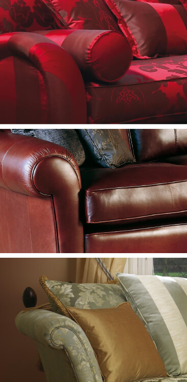
Crimson Cat were delighted to produce 4 range brochures for Wade. Accurately translating the individual style and quality of the bespoke sofas and chairs into print was essential. Using high level yet delicate retouching and elegant typography, the brochures for the first time communicated the products as they really are, beautiful and impeccably made.

